EasyCinema - Movie ticketing Website (study project)
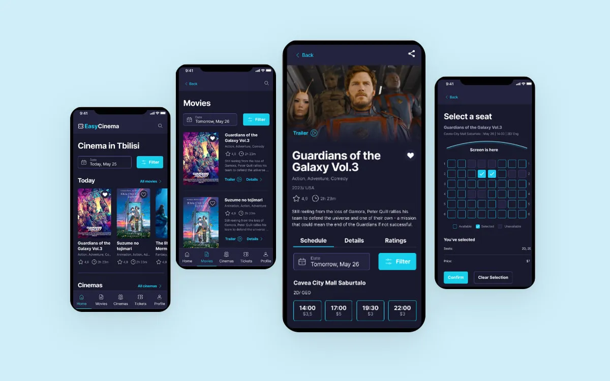

The product: EasyCinema is a ticketing Web & Mobile for a movie theater in Georgia. EasyCinema strives to provide an easy way to find and book a movie tickets for the customers. EasyCinema targets the users who don’t want to spend their time waiting in a queue, and especially those who are looking for a specific formats.
Problem
Busy students and working adults lack of time to buy tickets in a queue of movie theater.
Some of them are struggling to communicate at ticket counters since they don’t know local language. At the same time local apps and websites have poor translation for their products.
Goal
Design an easy‑to‑use and friendly ticketing cross-device platform for a movie theater which help people to find available movies and book tickets.
My role
UX designer delivering the solution for a Web & Mobile App for a movie theater
Responsibilities
User research, Interviews, paper and digital wireframes, low and high‑fidelity prototyping, usability studies, accounting for accessibility, and iterating on designs.

User research: summary
I conducted interviews and created empathy maps to better understand users of a future Web & Mobile App.
Primary group of users confirms the assumptions they are adults who want to save time buying a movie ticket in advance avoiding queues.
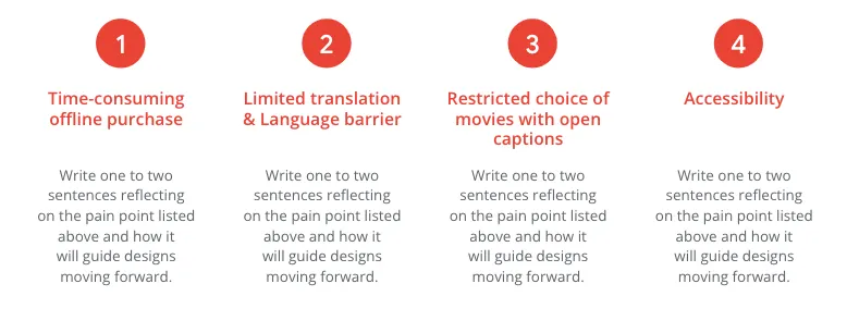
Research revealed that besides time there are there an other issues that users are facing trying to book a ticket. The challenges like limited translation options, insufficient information, language barrier etc. impact on the user experience.
User research: pain points
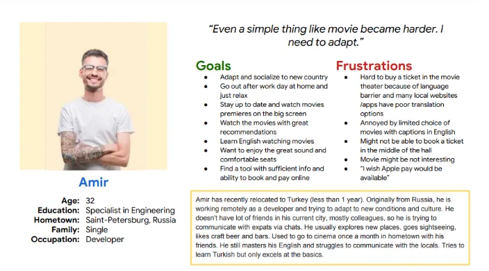
Persona: Amir
Problem statement:
Amir is a working expat who needs an app helping to find a movie in english with open captions in the cinema nearby and book a ticket because he struggle to understand local language and too fast English speech and don’t want to spend time in a queue
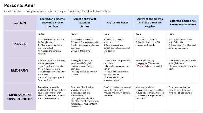
User journey map
User journey map represent POV of one of the personas: working expat willing to watch a movie premiere but is limited by language barrier and hearing ability.

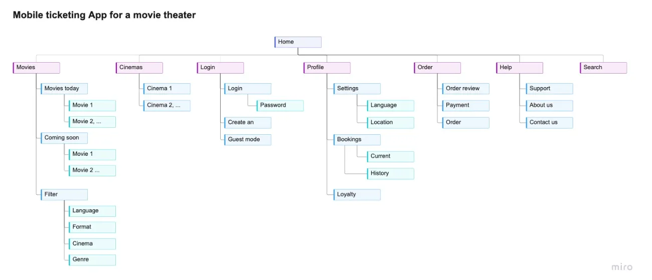
Sitemap
Difficulty with website navigation was a primary pain point for users, so I used that knowledge to create a sitemap.
My goal here was to make strategic information architecture decisions that would improve overall website navigation. The structure I chose was designed to make things simple and easy.
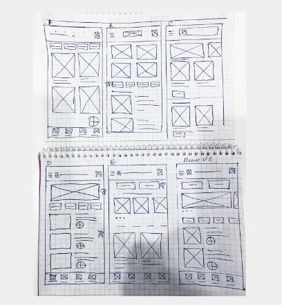
Paper wireframes
Taking the time to draft iterations of each screen of the app on paper ensured that the elements that made it to digital wireframes would be well‑suited to address user pain points. For the home screen, I prioritized a quick and easy ordering process to help users save time.
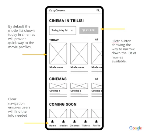
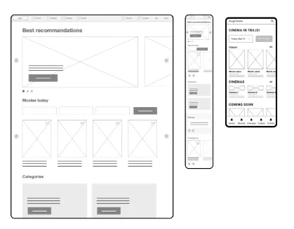
Digital wireframes screen size variations
As the initial design phase continued, I made sure to base screen designs on feedback and findings from the user research.
Easy filtering for movies was a key user need to address in the designs in addition to equipping the app to work with assistive technologies.
Low‑fidelity prototype
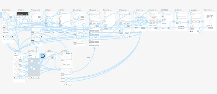
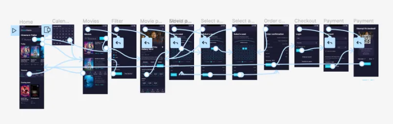
Using the completed set of digital wireframes, I created a low‑fidelity prototype. The primary user flow I connected was finding a movie for tomorrow’s date in english with subtitles and book a ticket. Prototype link
Usability study: findings
- Study type
- Unmoderated usability study
- Location
- Georgia, remote
- Participants
- 5 participants
- Length
- 20 minutes
I conducted two rounds of usability studies. Findings from the first study helped guide the designs from wireframes to mockups. The second study used a high‑fidelity prototype and revealed what aspects of the mockups needed refining.
-
Round 1 findings
-
User needs confirmation step
-
Users missed non prominent filter
-
Users want to see prices
-
-
Round 2 findings
-
List option was preferred that tile
-
2D option wanted as a format
-
Users want a guest mode
-

Mockups
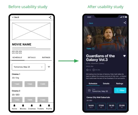
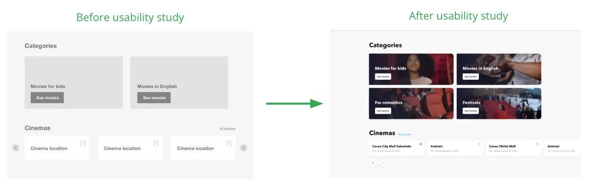
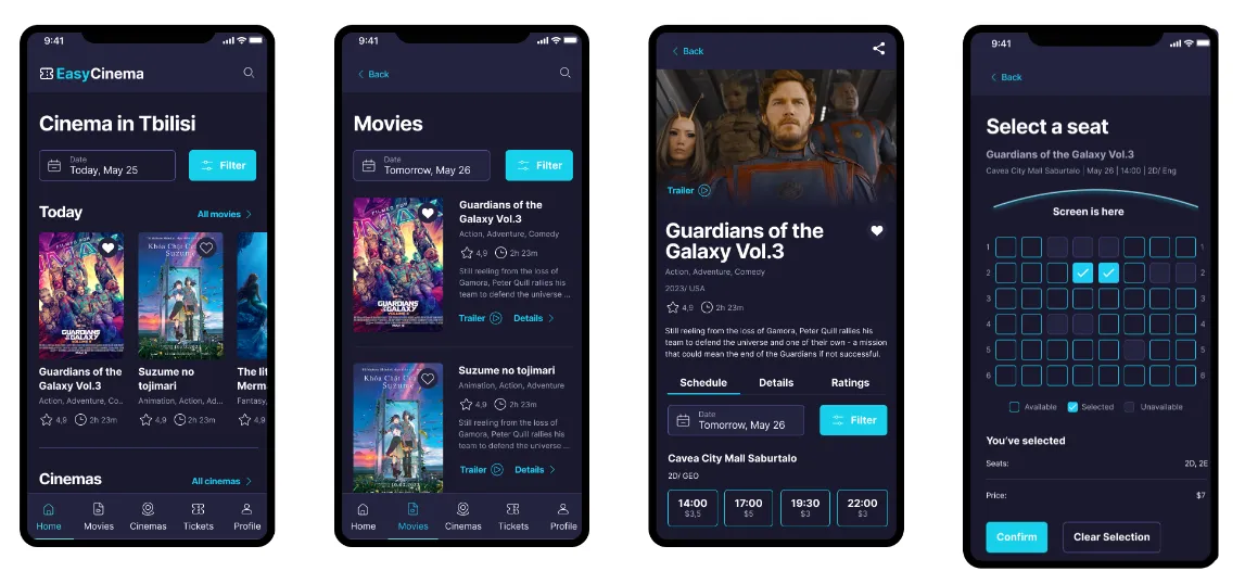
Early designs allowed to see the time slots, but after the usability studies, I added additional options to see the ticket price. I also revised the way to display filter button to make it more prominent
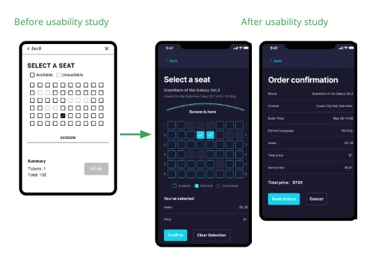
The usability study revealed that users wanted to see more summary info. To overcome the user frustration with the checkout flow i added “Order confirmation” screen. Also additional reminder added to seat selection screen to confirm previous selection.
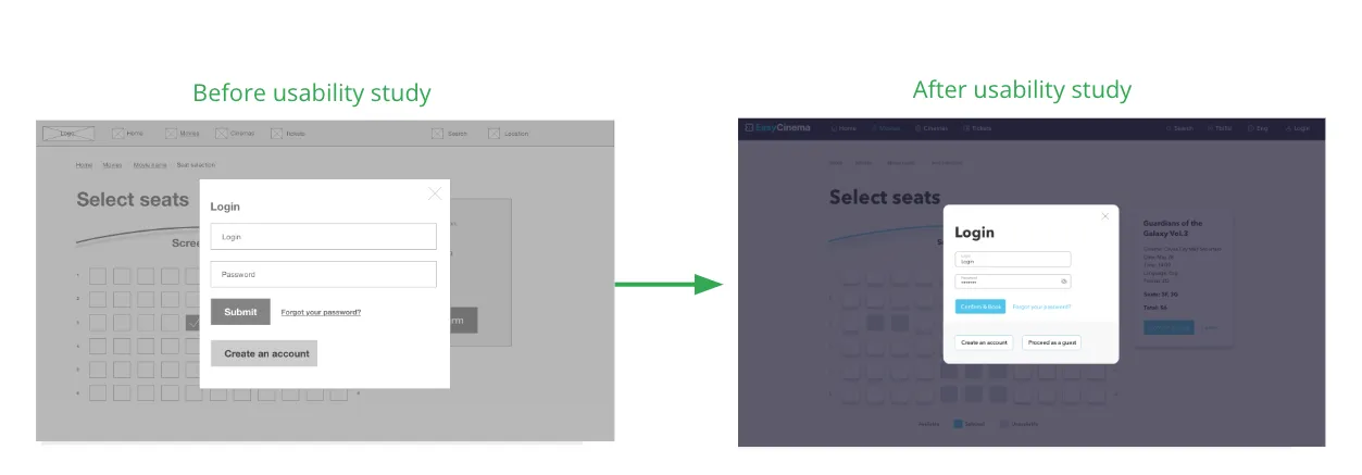
To make the checkout flow even easier for users, I added a guest mode option to proceed
Study discovered that users have intentions to find specific genres or options for movies and select the nearby cinemas, so i provided the quick way to find it
Mockups: different screen sizes
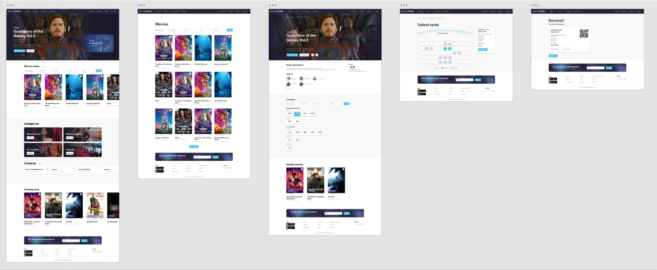
Mockups: Original screen size
High‑fidelity prototype
The final high‑fidelity prototype presented cleaner user flows for finding a movie, booking a ticket and checkout. It also met user needs for an easy filtering and price displaying.
Prototype link for App Web prototype
Accessibility considerations
Provided access to users who are vision impaired through adding alt text to images for screen readers.
Used icons to help make navigation easier. Use contrast fonts.
Avoid disabled element and provide a system feedback instead

Takeaways
Impact:
The app makes users feel like EasyCinema really thinks about how to meet their needs.
One quote from peer feedback:
“ I need that product in my life. As an expat i’m struggling to find available movies for me”
What I learned:
While designing the EasyCinema app, I learned that the first ideas for the app are only the beginning of the process. Usability studies and peer feedback influenced each iteration of the app’s designs. Insights from customers felt like co‑creation process.
Next steps
Conduct another round of usability studies to validate whether the pain points users experienced have been effectively addressed.
Conduct more user research to determine any new areas of need.
Access the additional functionality to meet customer needs and create killer-features for app.