ReadUp - Cross-platform tool to help learn to read in a new language (study project)
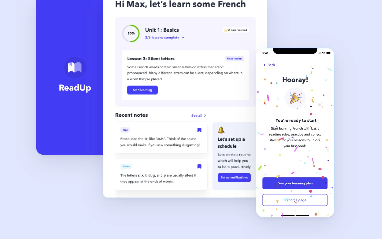

The product: ReadUp is a free cross-platform tool to help people learn how to read in a new language.
ReadUp provide an easy access to basic reading rules and exercises to get and master their language knowledge.
ReadUp targets the users who are truly beginners in language learning, and especially those who are looking for a methodic based education.
Problem
People who want to learn a new language face some challenges: educational programs and apps are quite expensive and sometimes don’t provide basic learning for those who try to learn for the first time. But nowadays foreign languages are highly needed in life.
Goal
Develop an app that provides free access to the basics of learning foreign languages and helps people improve their knowledge.
My role
UX designer delivering the solution for a mobile ticketing App for a movie theater
Responsibilities
User research, Interviews, paper and digital wireframes, low and high‑fidelity prototyping, usability studies, accounting for accessibility, and iterating on designs.

User research: summary
I conducted interviews and created empathy maps and personas to better understand users of a future platform. I also conducted secondary research to discover the issues that people face when trying to learn new language skills via apps.
Most users reported about costly language learning apps and courses. Research revealed some issues related to the education methodic of language learning. The challenges like jumping straight to the vocabulary building and exercises, frustrate the users new to the language and impact on the user experience.
Personas
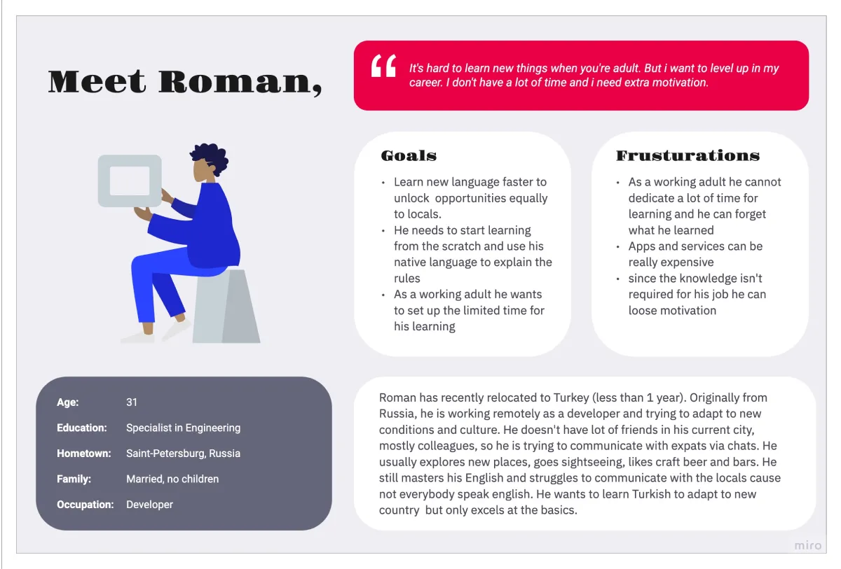
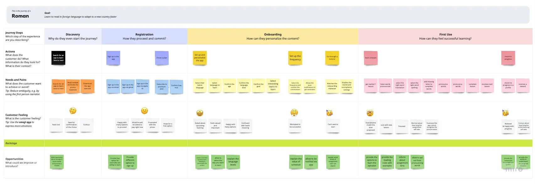
Roman
Problem statement:
Roman is a recently relocated working adult who needs to learn a basics of foreign language because he needs to adapt faster to a new country, read the city navigation and communicate with locals
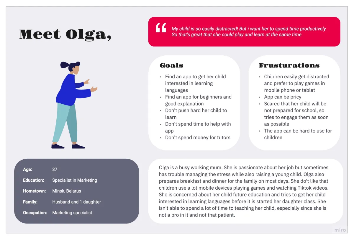
Olga
Problem statement:
Olga is a working caregiver who needs to get her child engaged in learning important skills because she wants her child spend their leisure time productively and their future be bright
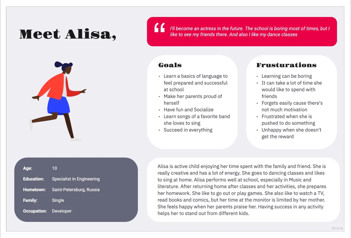
Alisa
Problem statement:
Alisa is a active school student who needs to practice new language as a game because she thinks learning is boring but doesn’t want to upset her parent
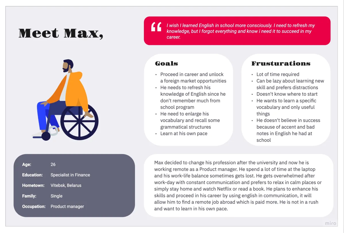
Max
Problem statement:
Max is a working adult planning to unlock new work opportunities who needs to refresh easily their knowledge to proceed in language learning because unlocking new opportunities abroad will raise his salary
User journey maps
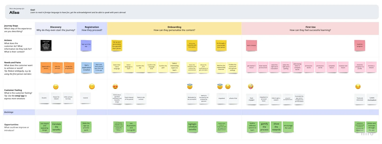
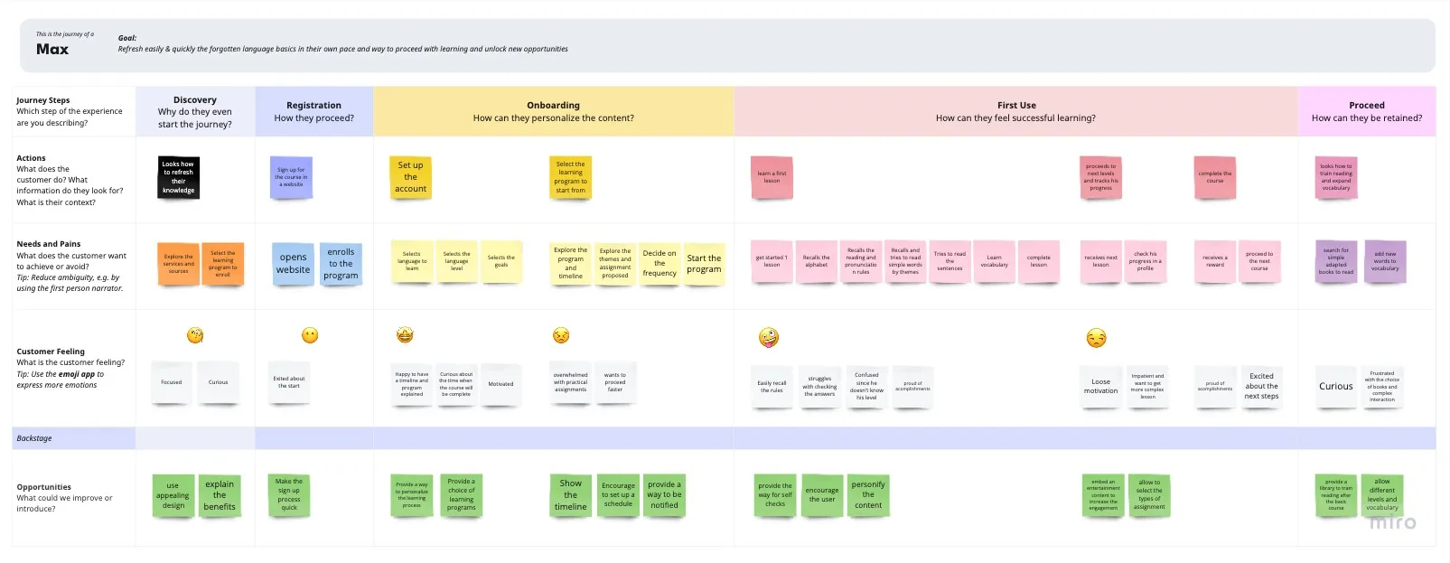
User journey map represent POV of one of the personas:
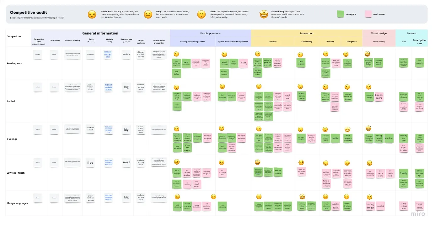
Competitive audit
An audit of a few competitor’s products provided direction on gaps and opportunities to address with the ReadUp app.
Ideation
I did a quick ideation exercise to come up with ideas for how to address gaps identified in the competitive audit. My focus was specifically on presenting the basic reading rules information.
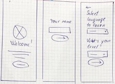


Digital wireframes
After ideating and drafting some paper wireframes, I created the initial designs for the ReadUp app. These designs focused on personalized of learning program and process of first lessons.
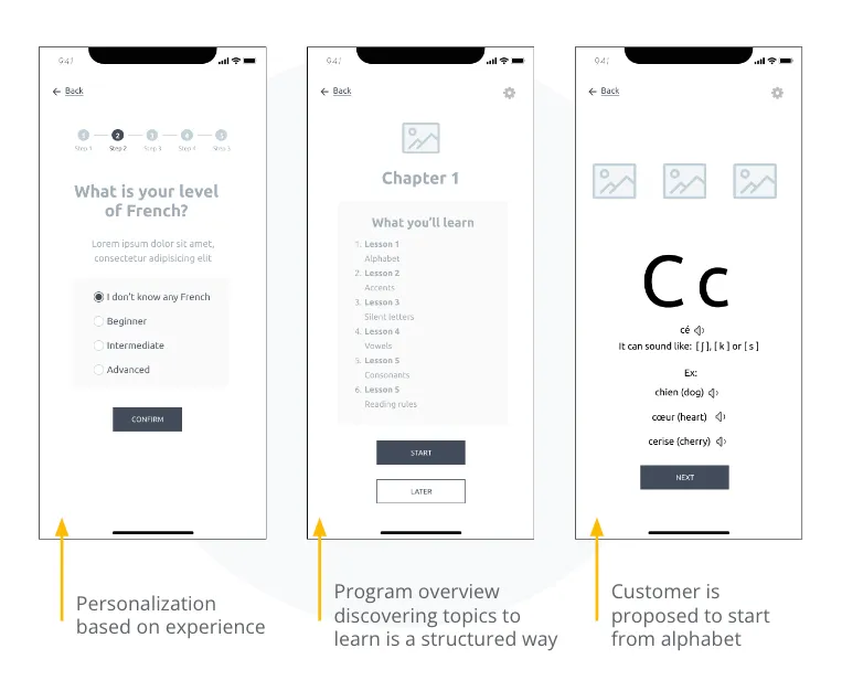
Low‑fidelity prototype
To prepare for usability testing, I created a low‑fidelity prototype that connected the user flow of launching the app, proceeding in personalization and learning first two lessons (samples).

Usability study: parameters
- Study type
- Moderated usability study
- Location
- Remote (Georgia, Belarus, Vietnam)
- Participants
- 5 participants
- Length
- 30-40 minutes
Usability study: findings
These were the main findings uncovered by the usability study:
-
Easy start People want easy access to app to make a decision if they would use it, so many steps personalization and onboarding are frustrating
-
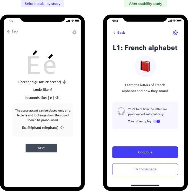
Auto play People like the ability to hear the sounds in app but want to be prevented about autoplay or even more switch it off by default
-
Program overview People preferred to see the whole program overview and their progress in learning
-
Taking notes People wanted to be able to save complex rules and tips on their profile so they could refer to them.
-
Gamification Some people wanted to see more playful mechanics in prototype cause they need more motivation, at the same time other people reported they don’t want to be overwhelmed by too much praises and success screens
-
Clear progress and goals People expressed their need to understand clearly how fast they could achieve their learning goal and to be additionally notified about their progress in the program while they are step by step

Mockups
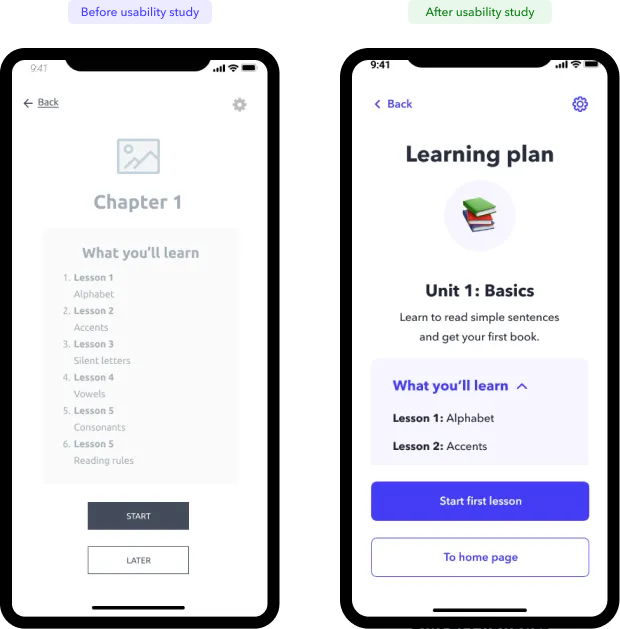
Based on the insights from the usability studies, I applied design changes like providing a clear whole program overview and enhanced it with goal statements for each unit.
Also i reduced redundant steps to proceed to a next lesson
I added an alert information for customers about auto‑play sounds in the app and provided the opportunity to switch it off on the same screen.
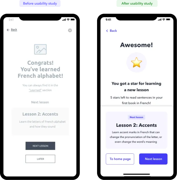
Additional design changes included reviewing flows and making less screens transitions. I included info and CTA to launch the next lesson to the success screen of the previous one.
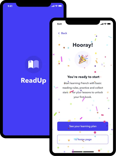
I also added a legend about app mechanics - now user is gaining stars for lessons and it gives them a free books, some confetti to the success animation made it more playful
High‑fidelity prototype
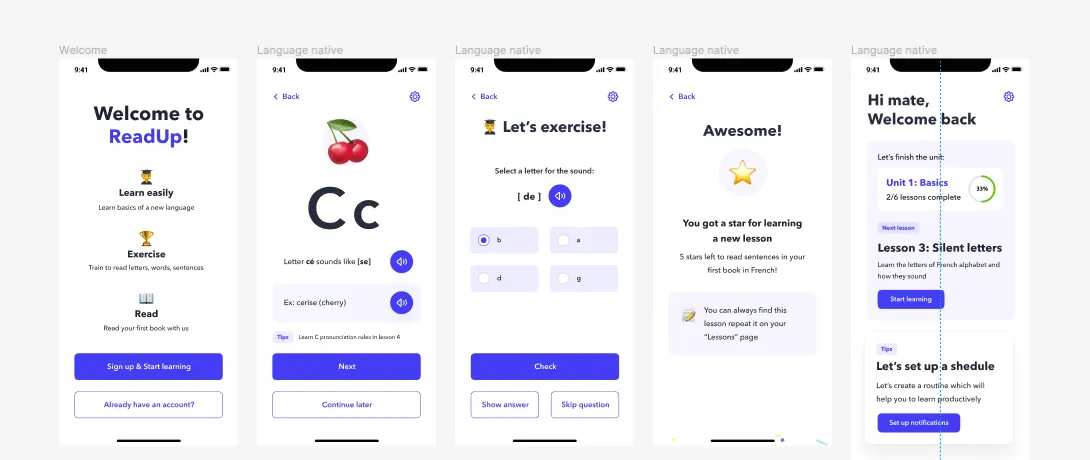
The high‑fidelity prototype followed the same user flow as the low‑fidelity prototype, including design changes made after the usability study.
Accessibility considerations
Clear labels for interactive elements that can be read by screen readers.
Initial focus of the home screen on learning process and easy access to next lesson
Avoid disabled element and provide a system feedback instead

Sitemap
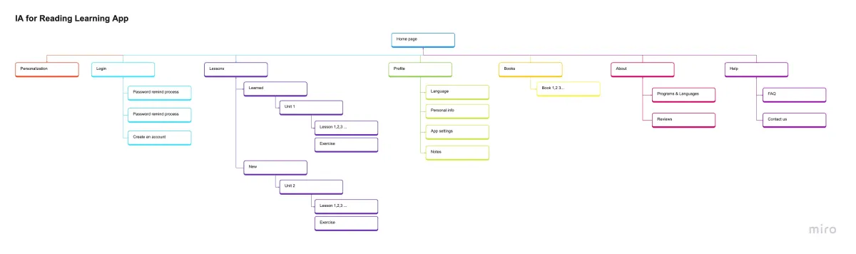
With the app designs completed, I started work on designing the responsive website. I used the app sitemap to guide the organizational structure of each screen’s design to ensure a cohesive and consistent experience across devices.
Responsive designs
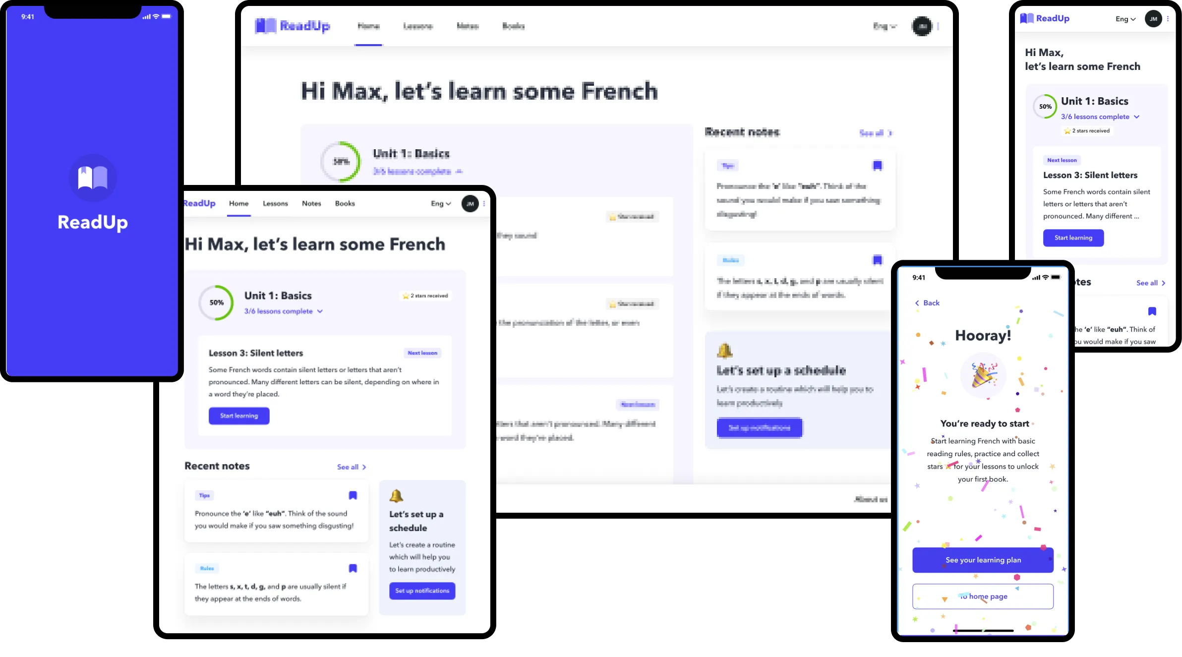
The designs for screen size variation included mobile, tablet, and desktop.
I optimized the designs to fit specific user needs of each device and screen size.

Takeaways
Impact:
Users shared that the app is easy to use and the fact it’s for frere made them happy.
The quote of the user testing participant:
“ The French is hard to learn, but the app makes is simpler to learn the basics step by step”
What I learned:
I realized that even though the problem I was trying to solve is not only the question of good user experience, but also a methodics of education. Diligently going through each step of the design process and aligning with specific user needs helped me come up with solutions that were both feasible and useful.
Next steps
Conduct research on how successful the app is in reaching the goal to help to learn to read on more complex themes and exercises.
Work closely with methodologists to provide a unique learning program to be a core product
Think about rewarding the user progress and provide additional features to the app