B2B Procurement: Designing a Tender Management Platform
Dealingi came for a design review of finished mockups and stayed for a full redesign: from roles and the tender lifecycle to live bidding, responsive layouts and developer handoff.
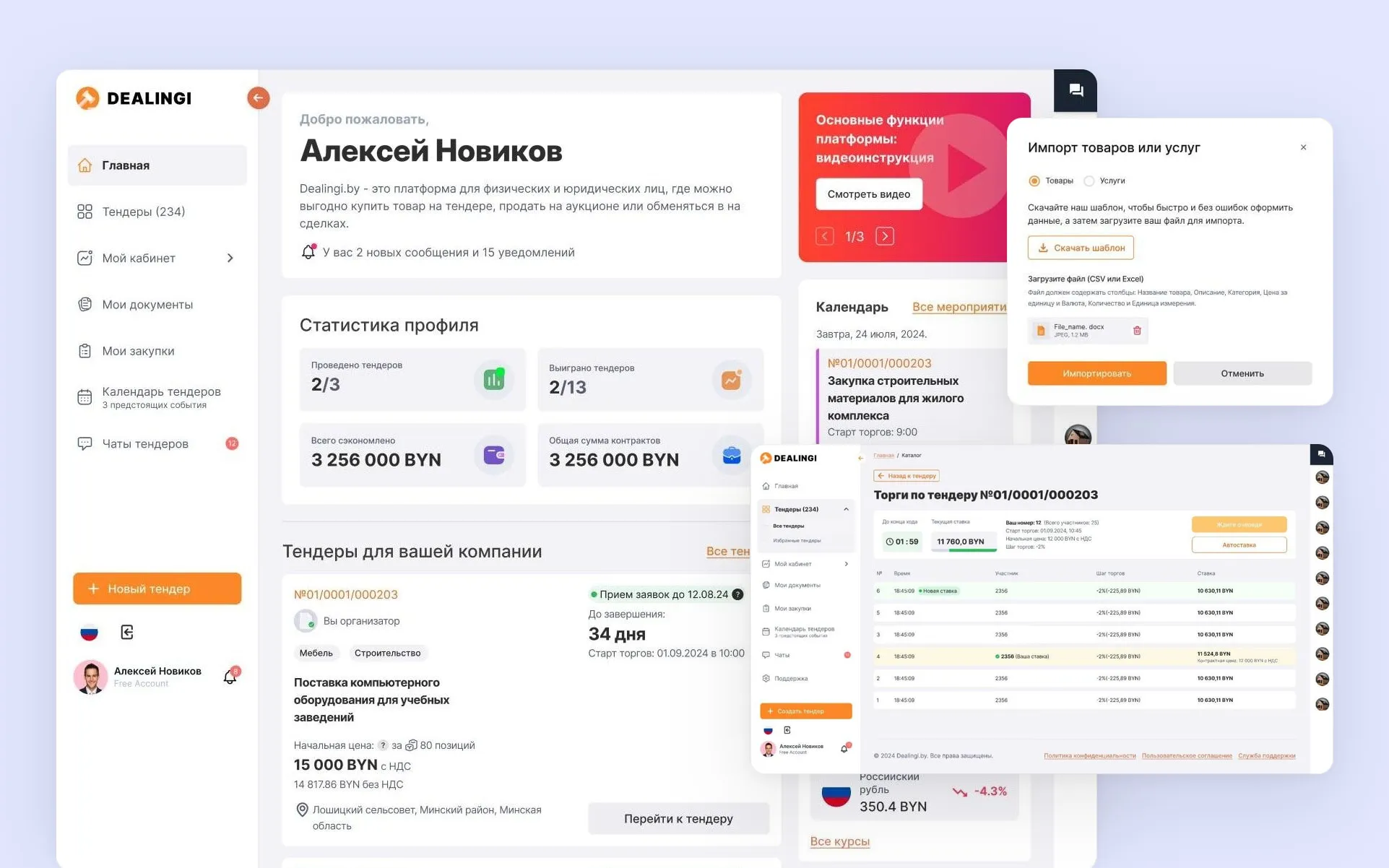
Platform: web, from 1920 down to 320 px.
Context: a review that turned into a redesign
Dealingi is a Belarusian B2B platform where companies buy through tenders and suppliers compete in reverse auctions. The same user can be a buyer and a supplier — sometimes on the same day.
The team came with a narrow request: a fresh pair of eyes on finished mockups before development. The review showed that the problem was not in individual screens but in the model: the interface described a “tender page”, while the product needed the tender as a process — with roles, stages and branches.
Before
One tender page for every case. What a buyer, a participant and a guest see, and how the screen changes between applications and bidding, was undefined.
After
The tender is a state machine. Every “role × stage” pair has its own screen, its own primary action and its own line about what happens next.
Stage 1. Design review
The review went through three layers, from the whole to the details.
-
Flows. The key paths of both roles from sign‑up to a closed deal: where the path breaks off or asks the user to guess.
-
Heuristics and consistency. Visibility of status, error prevention, one vocabulary and repeatable patterns.
-
Readiness for development. States, empty screens, errors, responsive behaviour — everything a developer would otherwise invent alone.
The main findings:
- No role model. Screens did not distinguish a buyer, a supplier, a participant and a guest.
- No stages. Accepting applications, waiting for bidding, bidding and completion looked like the same screen with different text.
- Branches were not described. What if there are no applications? If only one is approved? If a supplier has not filled in their profile?
- Tender creation was one long sheet. Payment and delivery terms were lost among dozens of fields.
- No system. Components were drawn per screen, and there were no responsive layouts.
The turning point. The list of findings made it clear that polish would not be enough: every screen would have to be fixed, and still without a shared logic. We agreed to design the platform anew — and the review became the brief.
Stage 2. Research
Stakeholder interviews — to pin down the rules of bidding: the decrement step, the minimum number of participants, what happens on cancellation.
Competitive analysis of tender and auction platforms: how they show status, how applying works, what happens at the moment of bidding.
A map of the tender lifecycle. The main artefact of this stage: every stage, the transitions between them, and what each role sees at each point.
| Stage | Buyer | Supplier |
|---|---|---|
| Accepting applications | Invites, reviews applications, requests documents | Studies the terms, applies or withdraws |
| Waiting for bidding | Sees the admitted participants | Sets up an auto‑bid |
| Bidding | Watches it unfold | Places decreasing bids |
| Completion | Confirms the winner, closes the deal | Sees the outcome: won or lost |
| Cancelled / failed | Picks a reason | Gets a notification that explains why |
Stage 3. Architecture and flows
The map produced the navigation: seven sections instead of a menu organised by page type — home, tender catalogue, my account, documents, my purchases, calendar, chats.
Flows are described separately for the buyer and the supplier, and the branches are screens in their own right rather than notes in the margin:
- no applications came in — the tender is cancelled automatically;
- a single application is approved — the buyer chooses: award it at the starting price or declare the tender failed;
- a supplier without a completed profile cannot apply — and sees exactly what is missing.
Swimlane: who does what, and when
The whole path of a tender is laid out in lanes — buyer, supplier, platform. A diagram like this shows at once where one role waits for another and where the system has to act on its own: close applications, start the bidding, send notifications.
The board can be panned and zoomed right here.
Key decisions
1. The dashboard changes with the user
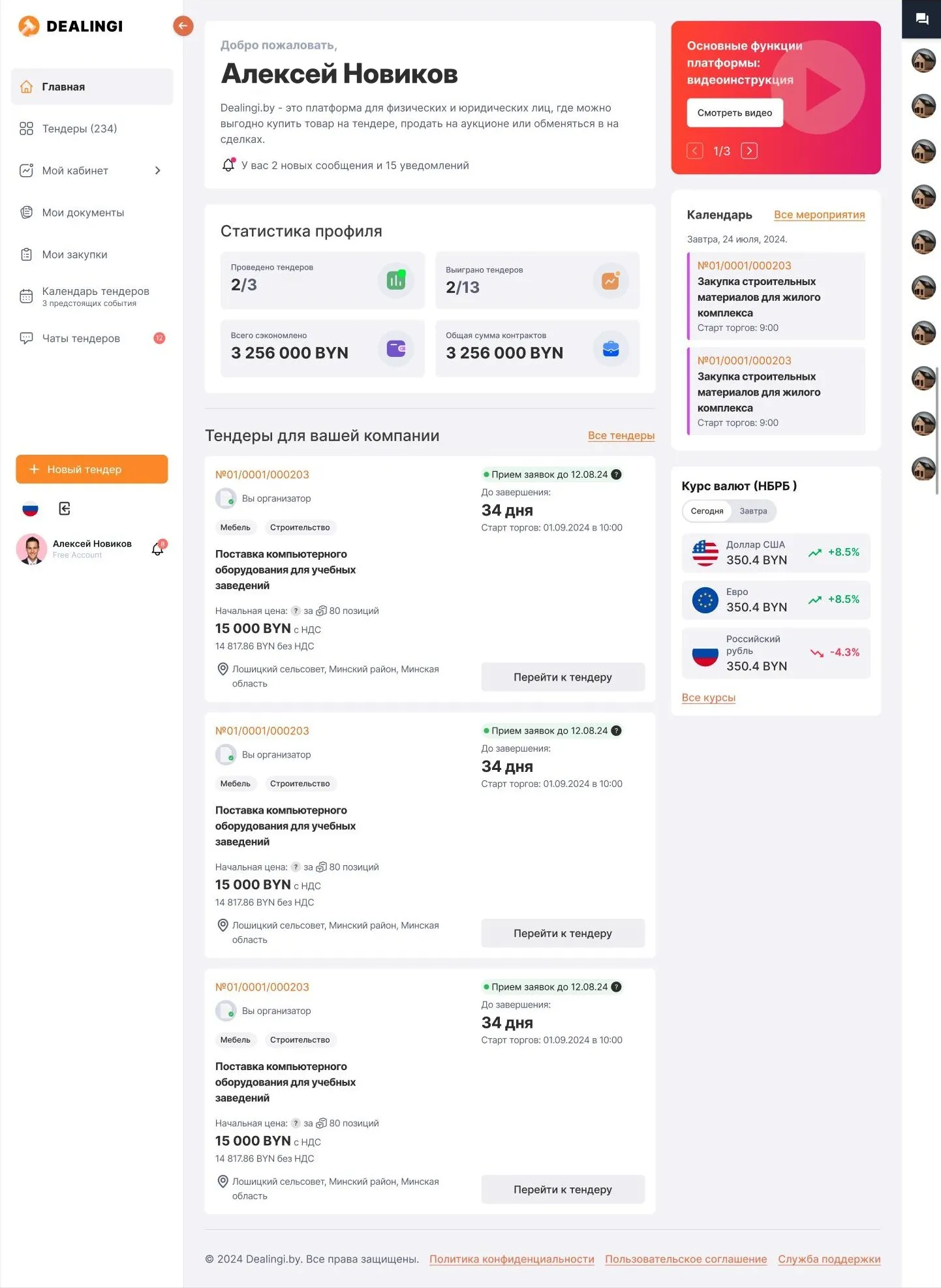
The dashboard has four states: just registered, profile filled in, addresses added, active as both buyer and supplier. A newcomer sees the next step; an active user sees statistics, matching tenders and tomorrow’s events.
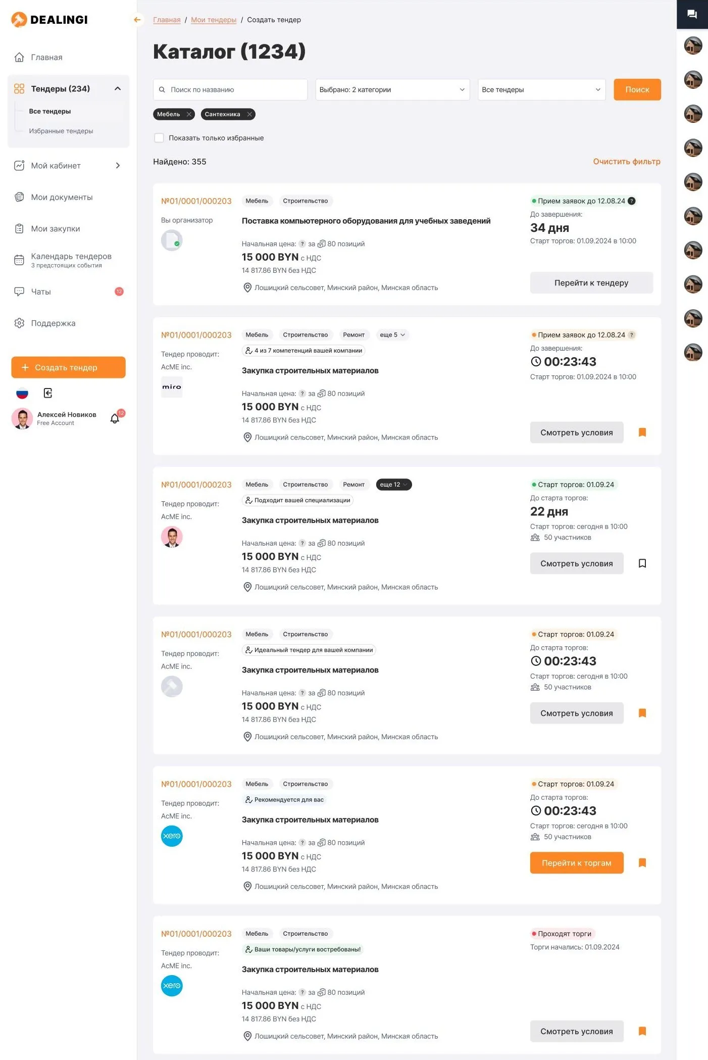
2. The catalogue answers “is this worth opening?”
A tender card carries the status with its deadline, a countdown, the starting price with and without VAT, the number of items and participants. A separate line explains why the tender is shown to you: “4 of 7 of your company’s competencies”, “Fits your specialisation”.
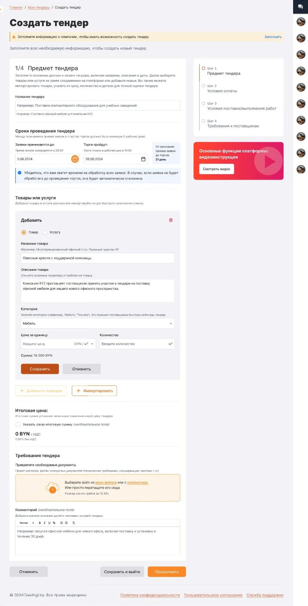
3. Creating a tender: four steps and a preview
Subject of the tender, payment terms, delivery terms, supplier requirements. The list of steps is always visible on the right, a draft can be saved at any of them, and the total without VAT is calculated automatically.
Step 1. Subject of the tender. Name, dates and items. The form works out how many days lie between the end of applications and the bidding, and warns that unprocessed applications will be rejected automatically. Goods and services are added one by one, right in the form, with no modal windows.
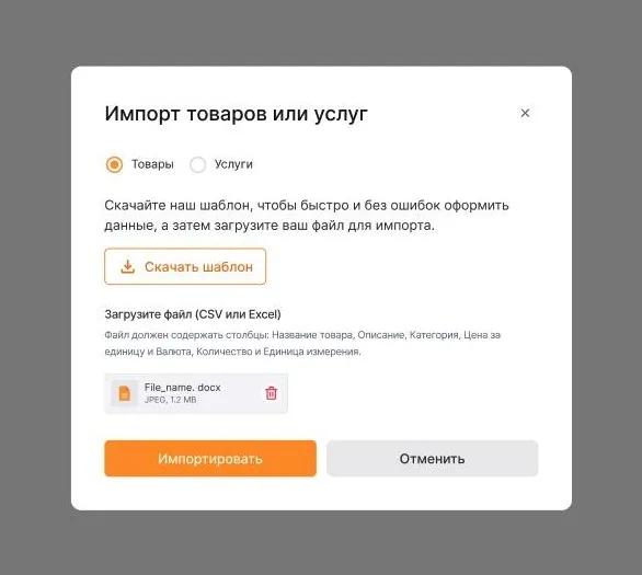
Importing items. Nobody fills in an eighty-item tender by hand. The list is uploaded from CSV or Excel using a ready-made template; a format error and an error inside the table are separate states, each explaining what to fix.
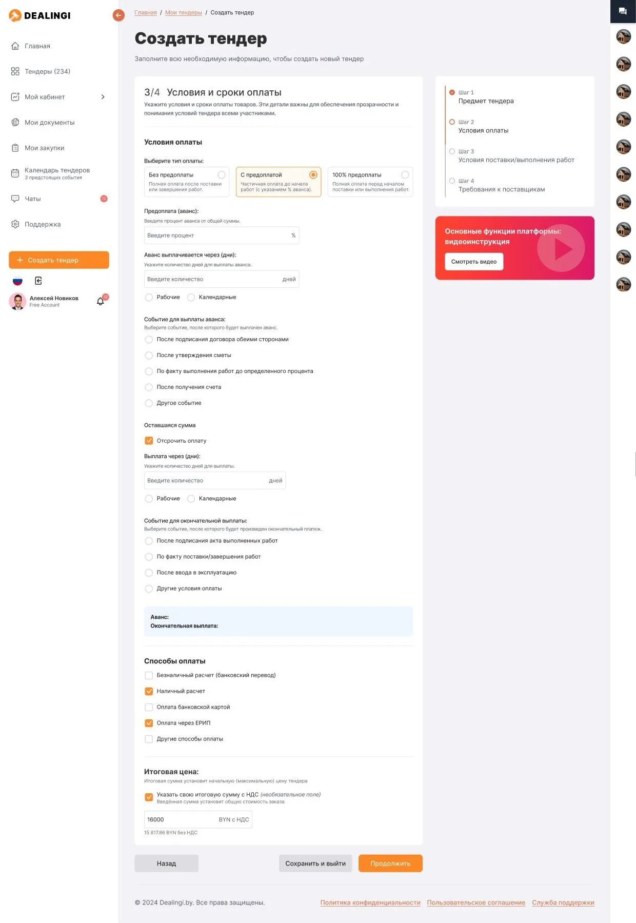
Step 2. Payment terms. Complex terms are assembled from simple choices: payment type, the size of the advance, the event that triggers it. Choosing a type reveals only the fields that belong to it.
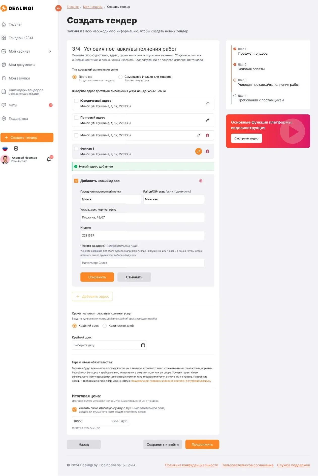
Step 3. Delivery terms. Delivery or pickup, an address from the company profile or a new one that can be added without leaving the form. The deadline is set as a date or as a number of days.
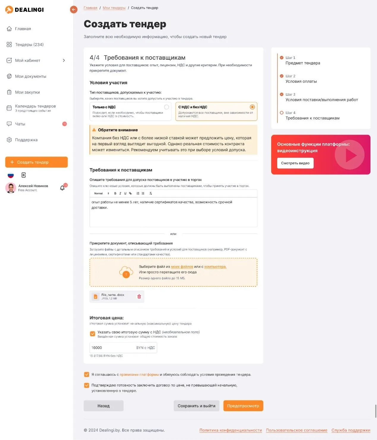
Step 4. Supplier requirements. Who is admitted — VAT payers only or everyone — and why it matters: a warning explains how the choice affects price comparison. Requirements can be written as text or attached as a document. Then comes a preview of the tender through a supplier’s eyes.
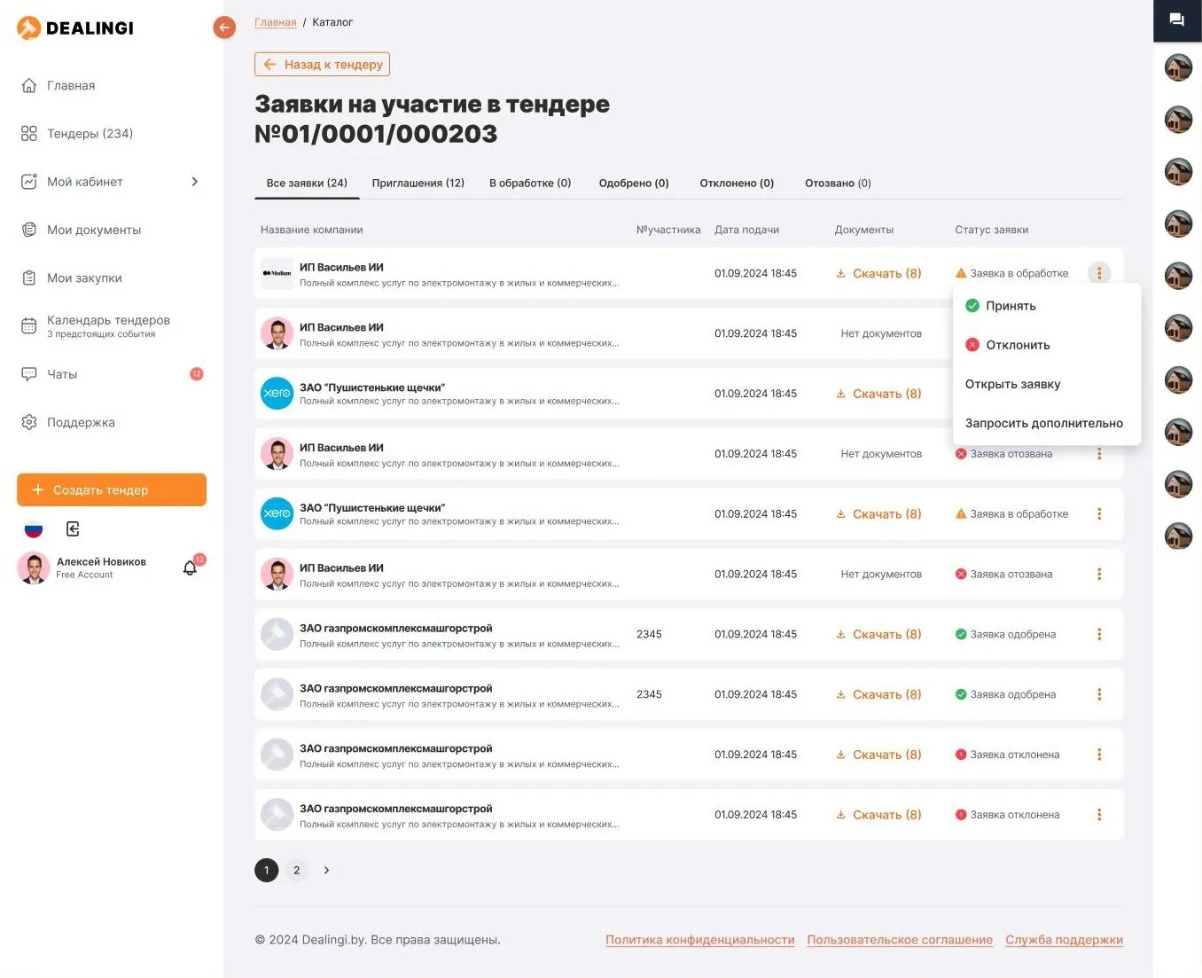
4. Applications are the buyer’s workbench
All applications sit in one table with tabs by status. From a row the buyer can accept, reject, open an application or request additional documents — without leaving for a separate page.
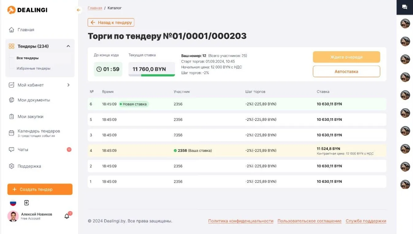
5. Bidding: everything that matters stays on screen
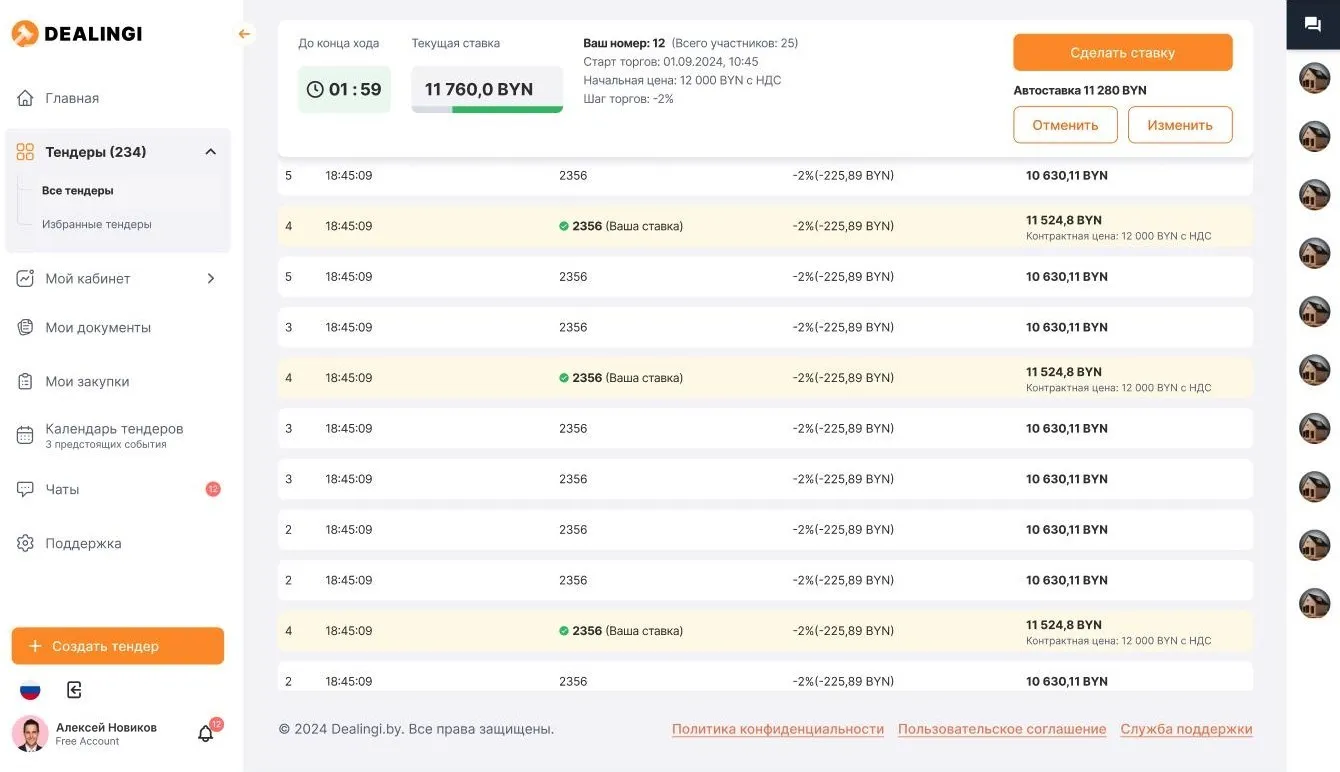
During bidding a participant has three questions: how much time is left for the turn, what the price is now, and where my bids are in the feed. The timer, the current bid, the step and the participant’s number sit in one block above the feed; the participant’s own bids are highlighted and a new one is tagged. Participants are anonymous — each has only a number.
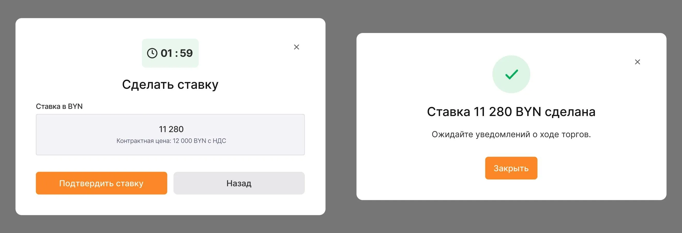
A bid takes two taps. The amount is already calculated from the step; all that is left is to confirm. The turn timer is repeated inside the dialog, so there is no need to close it to check the time.
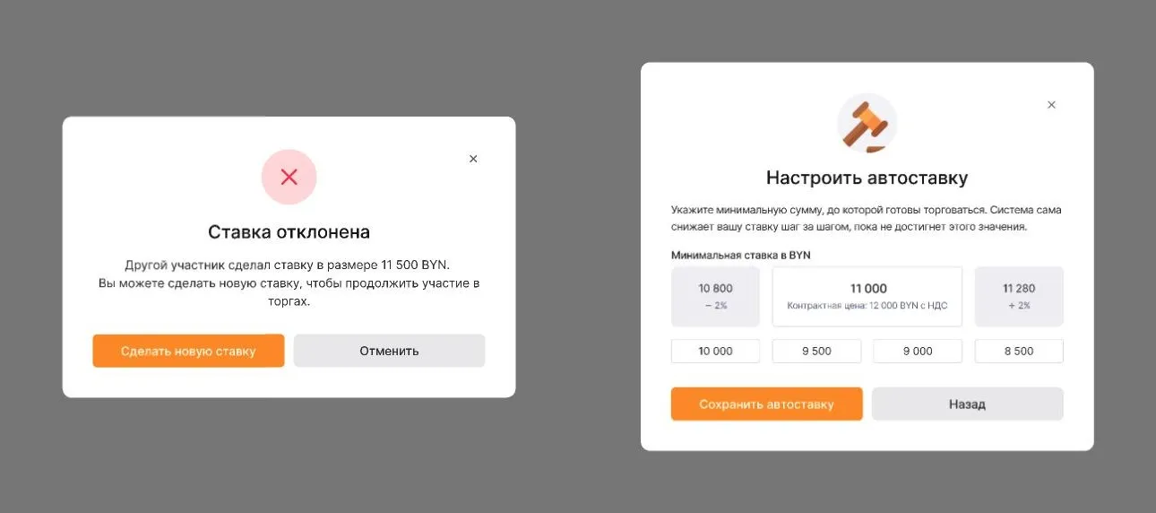
When a bid is beaten, the participant learns it at once and places a new one from the same dialog. An auto‑bid removes the need to sit at the screen: set a floor, and the system lowers the price step by step. The field will not accept an amount above the current bid — and says why.
When the feed grows long, the block with the timer and the actions pins to the top: the auto‑bid can be changed or cancelled without scrolling back.
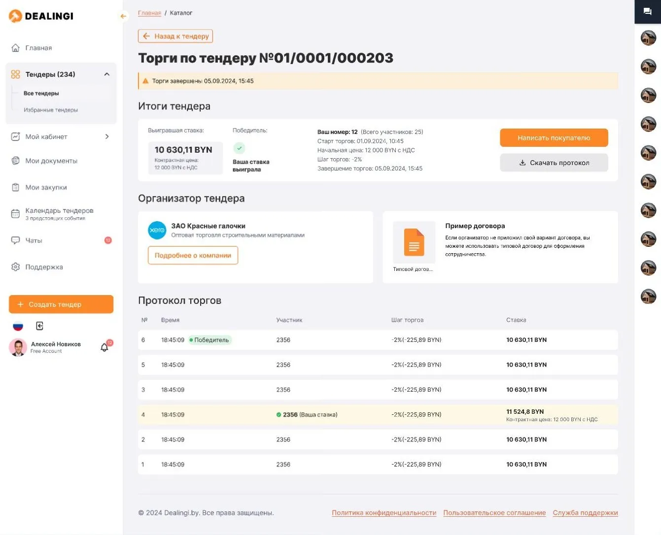
The outcome. Once bidding ends, the same page becomes the record: the winning bid, the winner, the organiser’s contacts, a standard contract and the bidding protocol to download.
6. Emails are part of the flow
A tender runs for weeks, and for most of that time the user is not in the product. So a matrix of emails for both roles was designed together with the screens: an invitation, a reminder two days before applications close, the decision on an application, bidding starts tomorrow, the outcome.
System and handoff
A component library — typography, buttons, fields, cards, statuses — was built before the detailed screens, so new sections were assembled from what already existed.
Seven widths: 1920, 1600, 1440, 1280, 1024, 768 and mobile. Responsive layouts are drawn for every key screen, bidding included.
Sections are marked ready for development as they close: a developer sees what can be picked up and what is still under discussion.
Outcome
The platform is designed end to end: sign‑up and company profile, tender creation, the catalogue, the tender page in every role and stage, applications, bidding with auto‑bid, purchases, calendar, support and emails.
What was hard
One entity, many faces. A tender page easily turns into a pile of “if the role is this and the stage is that”. A state table saved it: we agreed on the table first and drew afterwards.
Rare cases matter more than frequent ones. A tender with a single application does not happen often, but that is the moment a buyer decides whether to trust the platform.
Screenshots are taken from the mockups, on demo data.