Maya: an intuitive AI‑powered browser
A browser that starts from what you intend to do rather than from tabs: email, notes, calendar and tasks in one window, with AI answering in interactive blocks. Nine months in a start-up — from founder interviews to a design system, a brand and a website.
Context
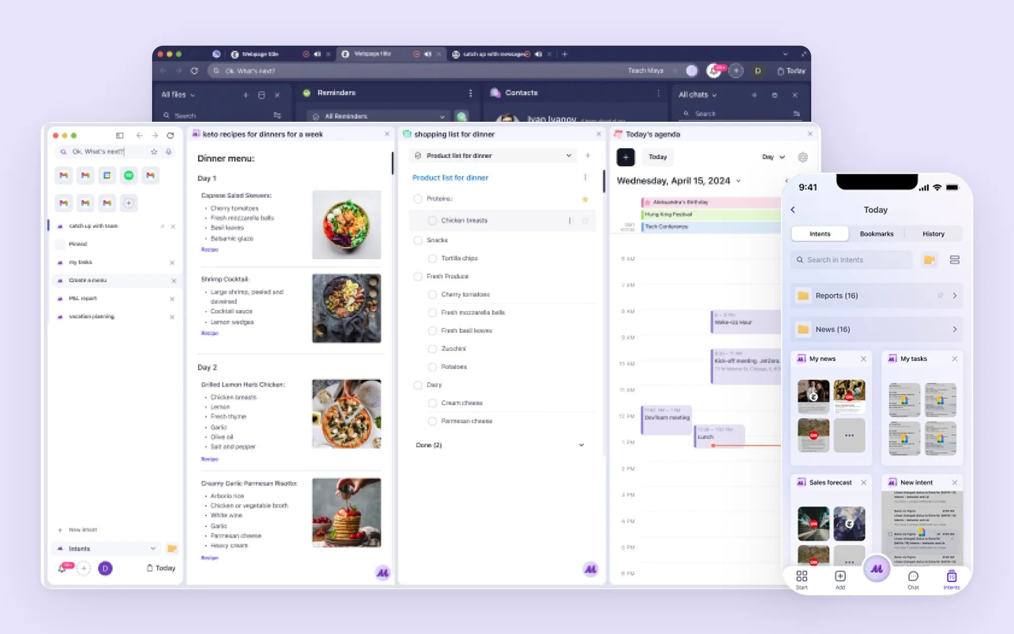
Maya is a browser with an AI assistant that brings email, notes, reminders, files and tasks into one window. The idea is that a person starts not from an app but from an intent: they say or type what they want to achieve, and the browser assembles the right interface.
It was a start-up with no established processes. The client was the CEO, who also acted as product owner, alongside a team of ten developers. For the first six months I was the only designer; for the last three I led a team of one or two designers.
- 9
- months on the product
- 10+
- plugins designed
- 10
- developers on the team
Challenges
- The product vision kept changing: service → browser → operating system → back to browser → niche service → back to browser. Each turn changed what counted as the main screen.
- There were plenty of ideas and not a single written scenario: the stream of ideas had to become clear flows that could be built.
- No design process or developer handoff existed — it had to be set up alongside the product itself.
- AI interfaces on the market misread intent and answered incompletely or off the mark, so users came to such tools already distrustful.
Goals
Create an all‑in‑one AI‑powered personal tool that improves productivity by bringing several features onto a single platform.
Combine email, reminders and notes into a solution built around intent rather than around apps.
Offer intelligent, context-aware suggestions based on what the person wants to achieve.
My role
- UX and UI of a complex AI product, from scratch
- Turning a chaos of ideas into clear user flows
- Visual language and branding
- The design process and handoff to development
- The design system and Storybook
- Managing a small team of designers and frontend developers
Process
-
Stakeholder interviews: business objectives, expectations, success metrics
-
Research: domain, competitors, user pain points, proto-personas
-
Scenarios and flows: user pain points and business goals turned into clear tasks
-
Architecture and navigation: accounts, spaces, intents
-
Plugins, mockups, design system and Storybook
-
Corridor testing and iterations
-
Visual language, brand and website
How I started
Stakeholder interviews
I began by talking to the founder: I needed to pin down the business objectives, align on expectations and agree on what success would mean. Those interviews gave the product its frame.
“Our mission is to help people achieve their goals and intents in the most effective way possible.”
“It’s like having a personal secretary or executive assistant, but without the downsides. The interface will always clarify and guide the user to their objective.”
“We need to shift away from static applications towards dynamic, goal‑oriented interfaces that show what’s relevant at the right moment.”
The founder described the users as busy executives — and, more broadly, knowledge workers who spend the whole day doing something at a computer.
Domain research
In parallel I studied the market through secondary research: trends, user sentiment, what AI technologies could do. Analysing how people use AI tools and where integration trips them up produced a list of pain points.
- Reduced productivity. AI tools are poorly integrated: workflows fragment, and switching between apps breaks focus.
- Lack of customisation. A tool is hard to adapt to one’s own workflow, so half of its capability goes unused.
- Inaccurate responses. The chatbot makes mistakes, which leads either to misplaced trust or to errors in the work.
- Outdated information. Free versions are updated rarely — their answers cannot support a decision.
- Privacy and security. In finance and healthcare, weak data protection stops such tools from being adopted in earnest.
Competitive analysis
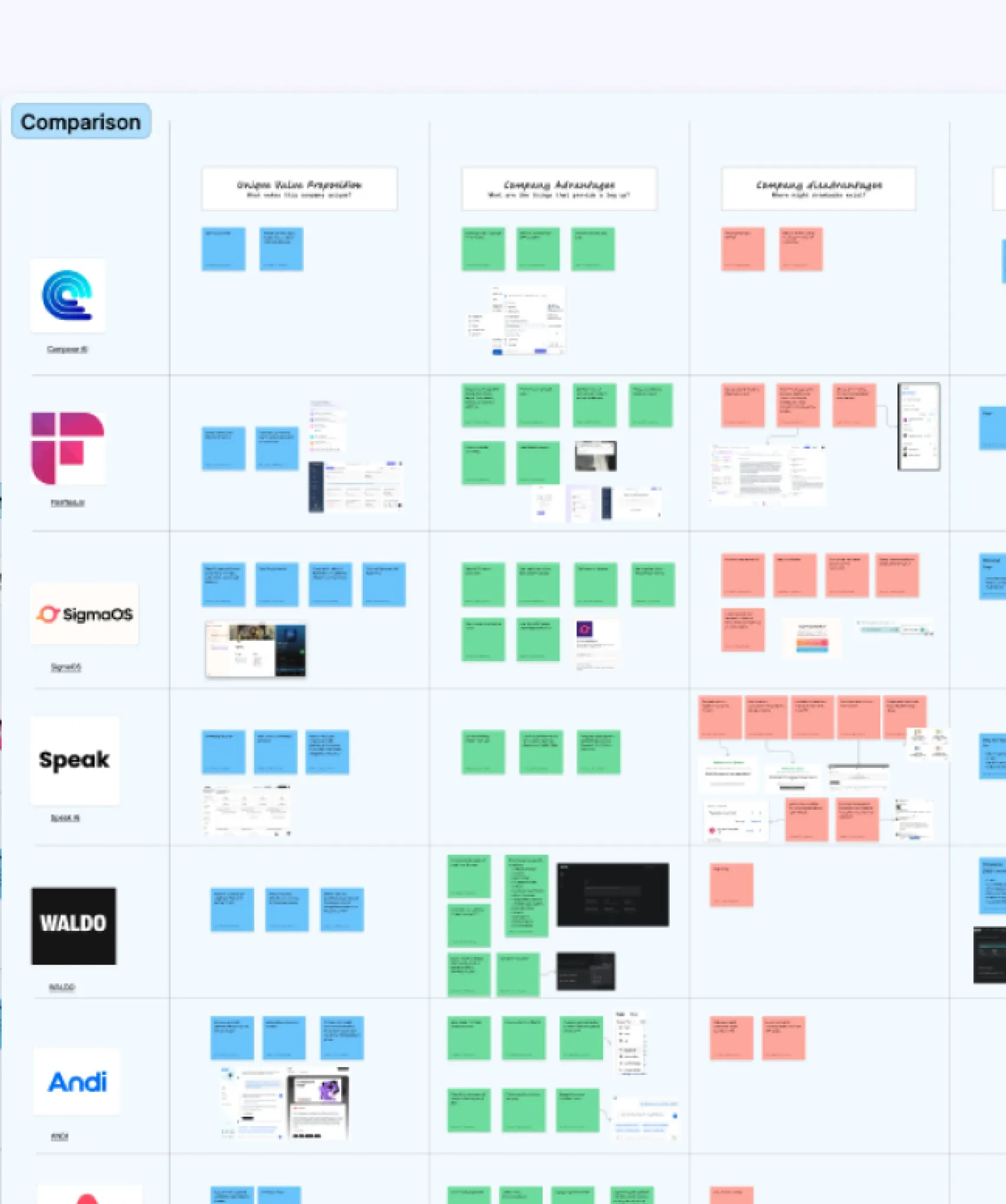
Together with the design team I analysed competitors — Fireflies, Arc Browser, Waldo — and niche AI products such as travel assistants. It showed where they are strong, where the gaps are, and how Maya could stand apart.
Personas and problem statements
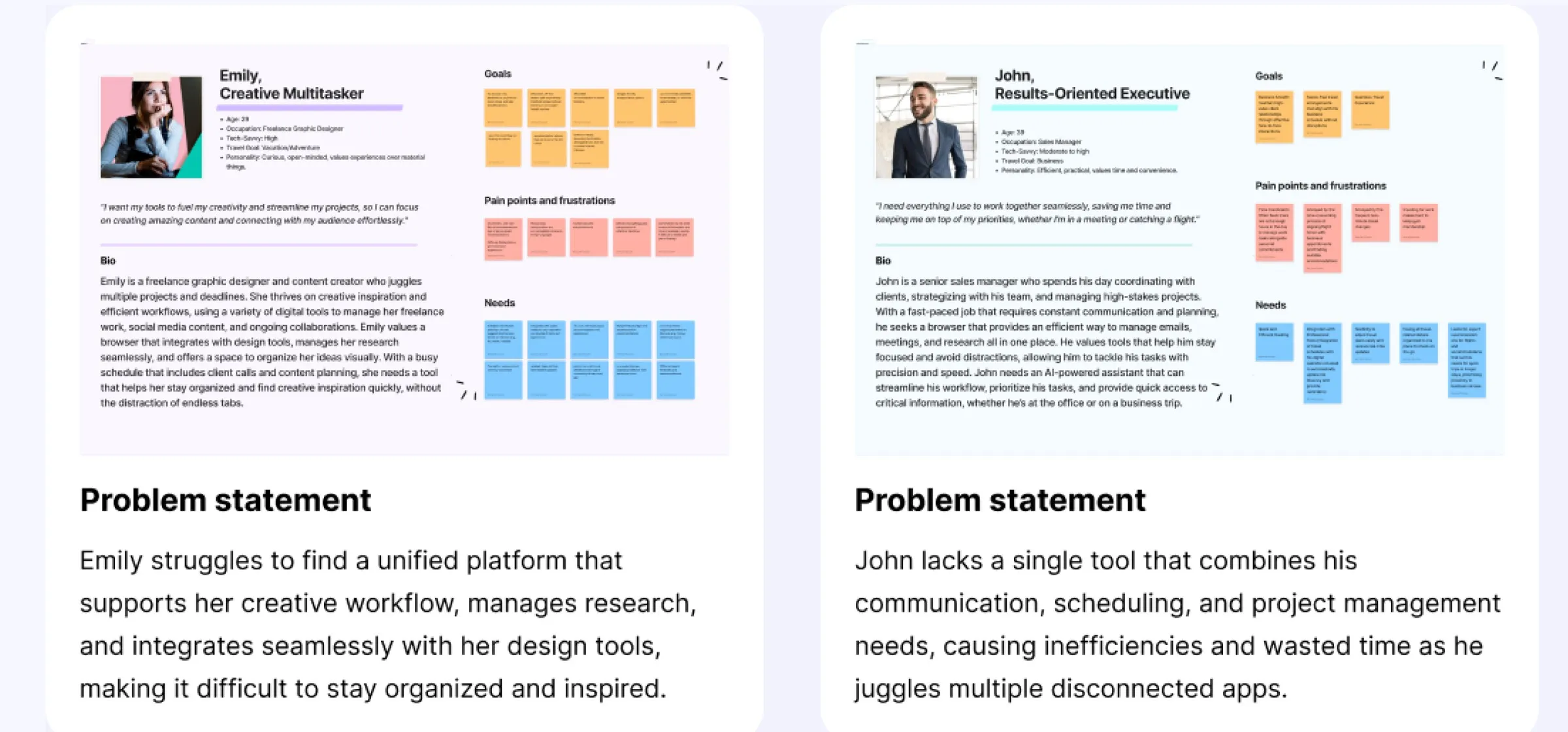
For one niche scenario — travel planning — I built proto-personas from reviews of similar services: Emily, a creative multitasker; John, a results-oriented executive; and Linda, who has to balance work, family and personal projects. Each got a problem statement: Emily cannot find a single platform for her creative workflow; John wastes time juggling disconnected apps for communication, scheduling and projects.
Scenarios and flows
I translated the pain points and business goals into scenarios: a busy professional with several inboxes, a project manager who cares about deadlines and risks, a team leader, a researcher, a sales manager, a remote worker. They helped prioritise features and explain decisions through the tasks of real people.
We kept no formal user‑story artefacts — a start-up had no time for them. Most of this work lived directly in tasks and documentation.
Architecture and navigation
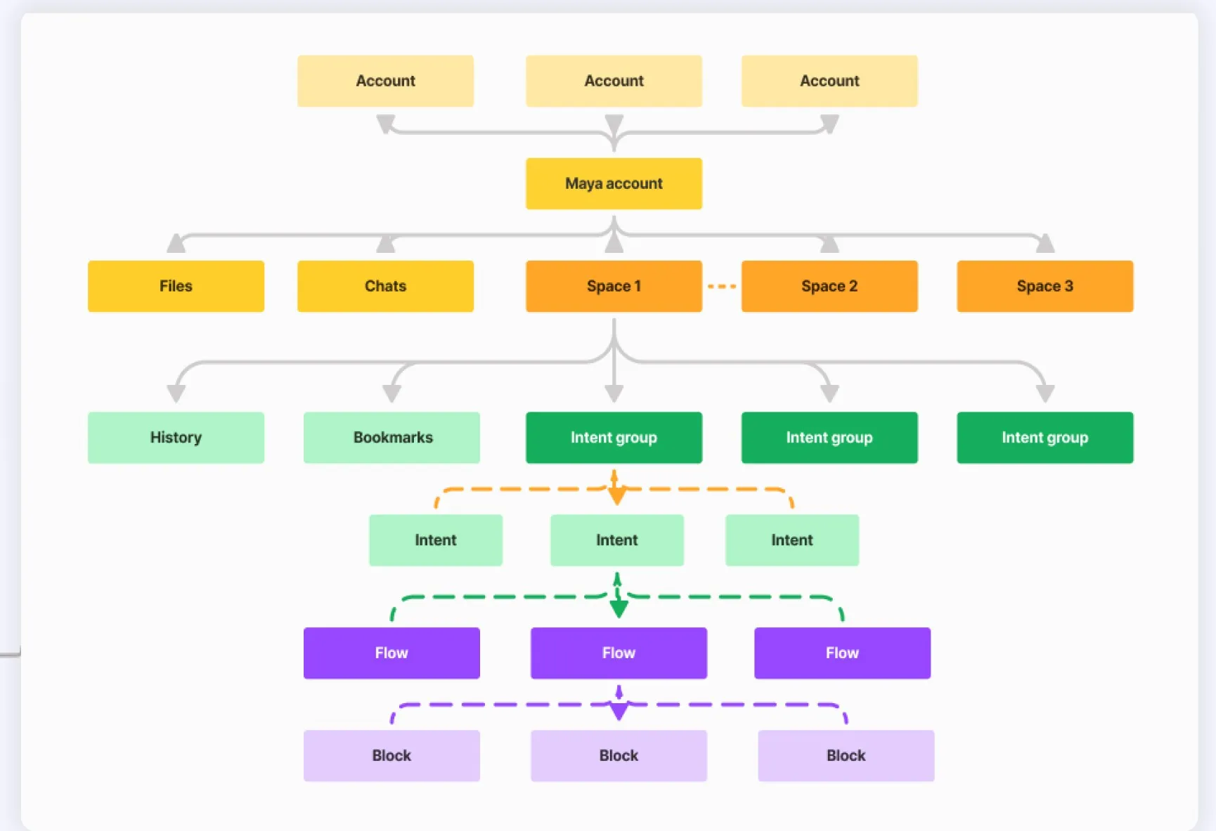
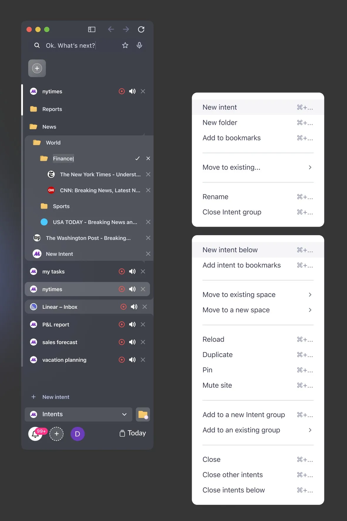
The hardest part of the structure was accounts. A person has several, and they all converge in one Maya account. Below it sit files, chats and spaces; inside a space — history, bookmarks and intent groups; an intent unfolds into a flow, and a flow is made of blocks.
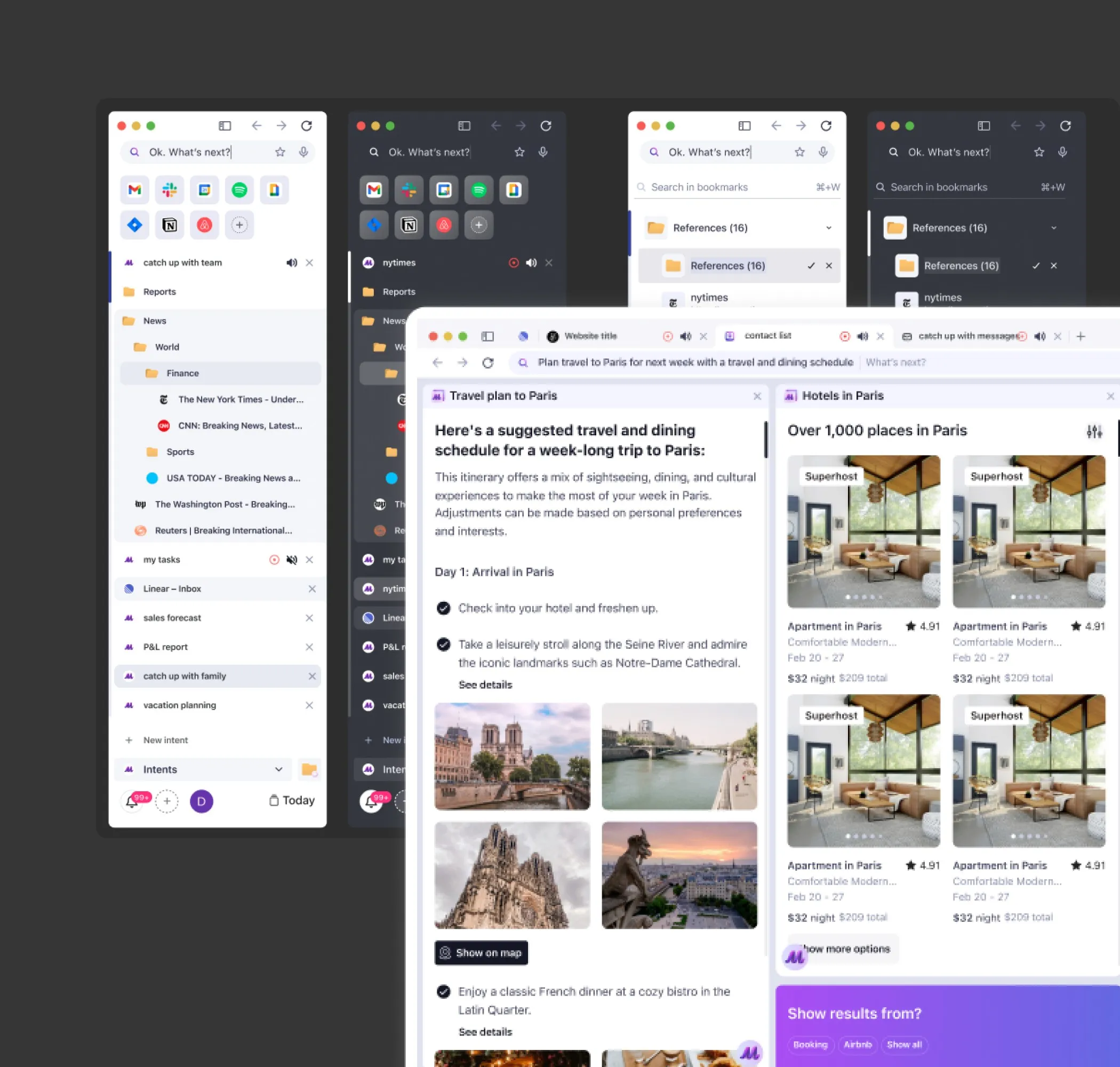
The familiar tab was replaced by an intent: it can be grouped, moved to another space, pinned or bookmarked. I designed navigation in two layouts — a horizontal one, close to a regular browser, and a vertical one with a tree of folders and intents. Instead of “enter an address”, the address bar asks “What would you like to accomplish?”, with voice input and smart suggestions beside it.
I refined and validated the structure together with the team: a person should move between plugins and account features without wondering where they are.

Plugins
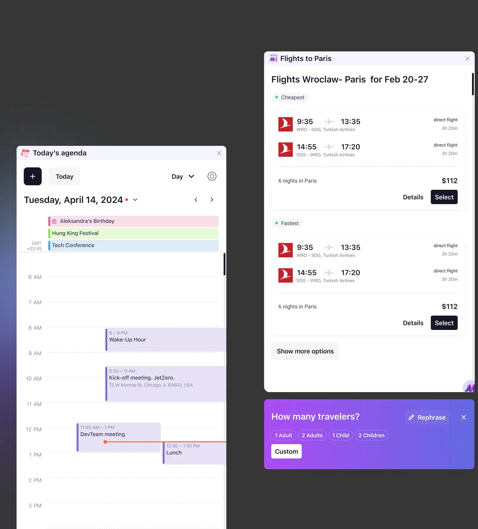
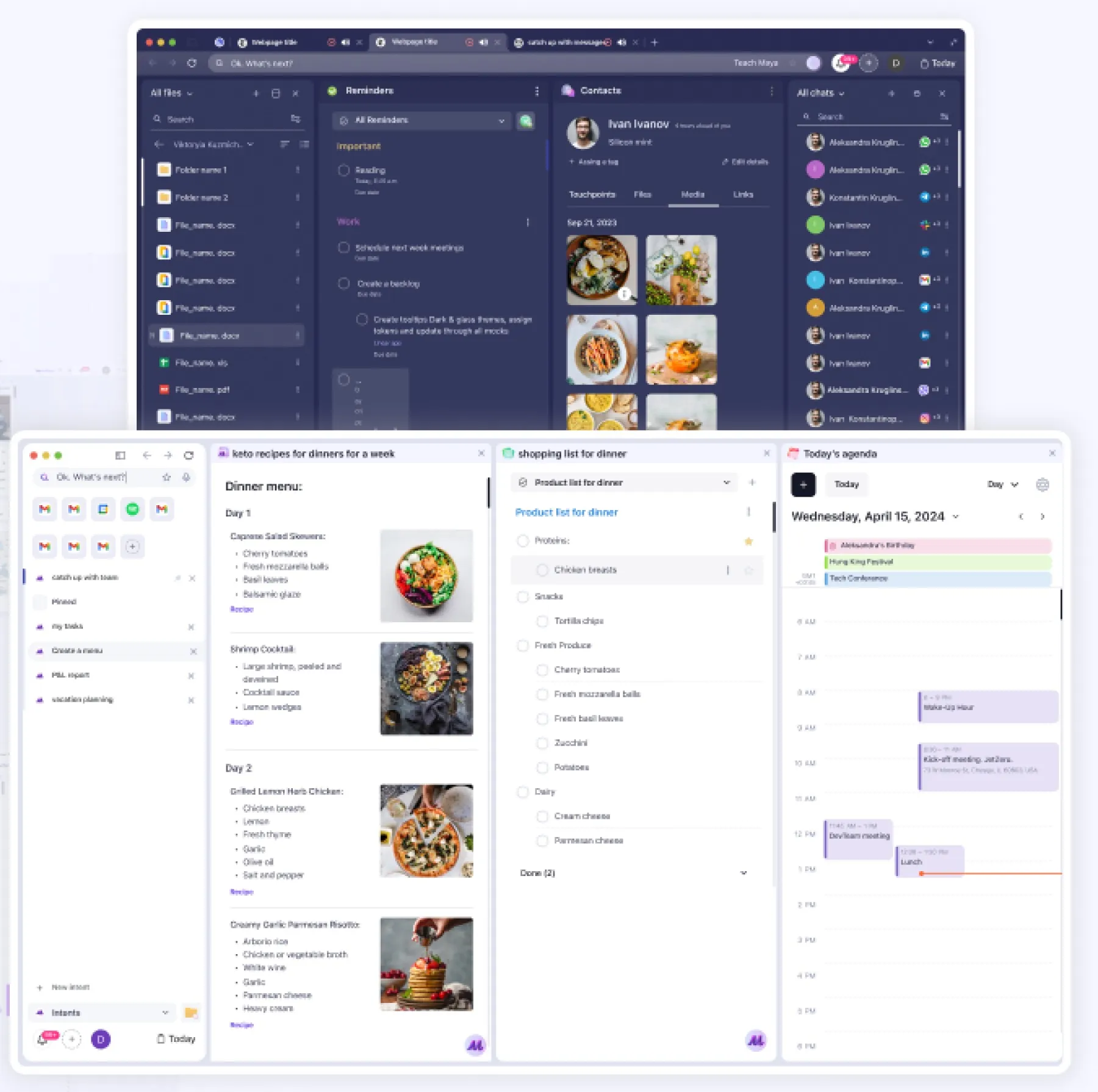
I designed more than ten plugins: email, calendar, notes, reminders, files, contacts, news, recipes and more. Each opens next to the others in the same window instead of taking the person to a separate page.
An AI answer is not a wall of text either, but an interactive block. Asked about a flight, Maya shows flight cards with a select button and asks how many people are travelling — with ready options, not an open question.
Mockups
I took the key use cases and complex flows to detailed mockups. They did three jobs at once: validate an idea quickly, show it to the founder, and give developers an unambiguous reference.
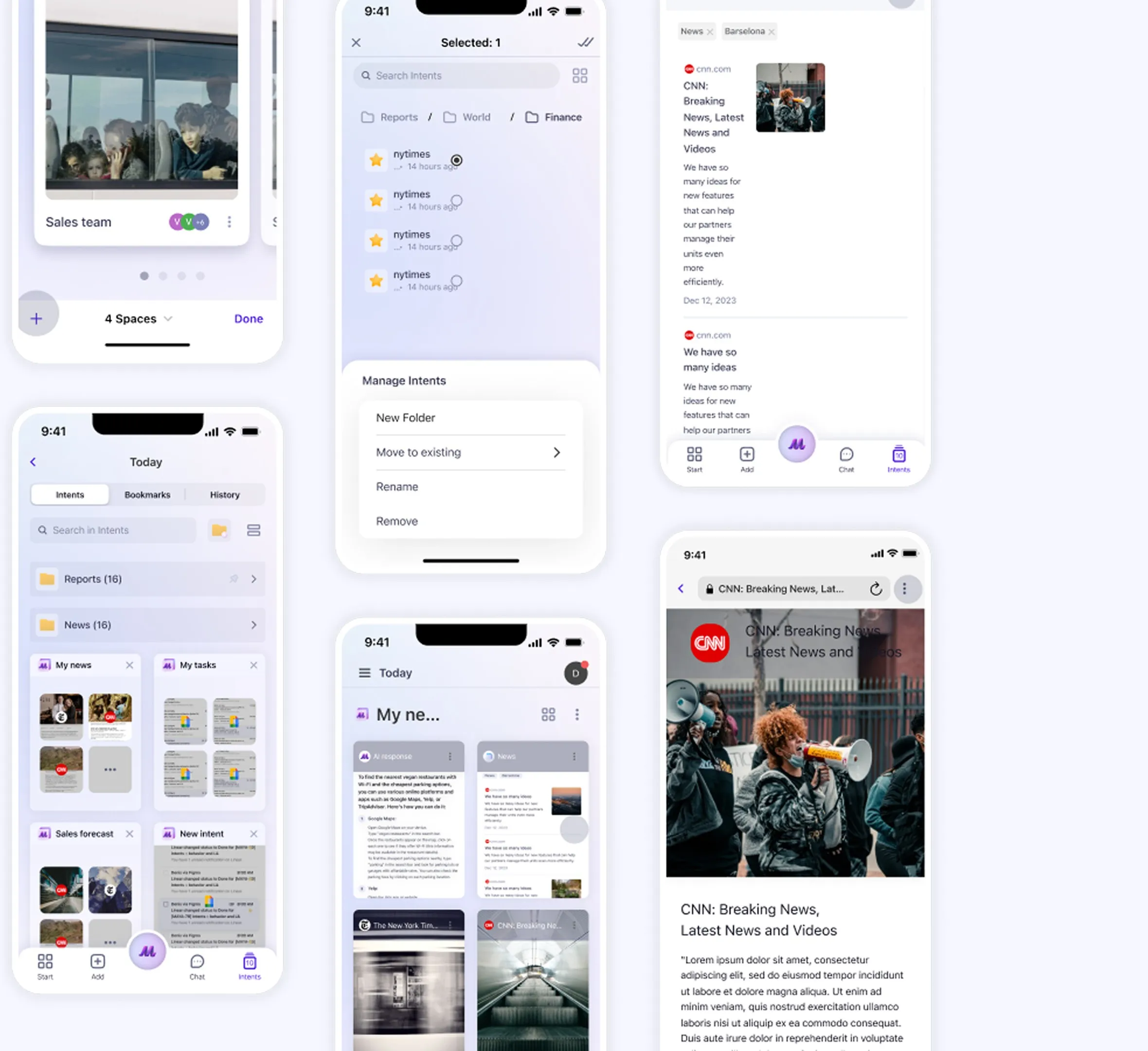
Mobile
The mobile version was designed by another designer; I gave direction, reviewed the work, kept it consistent with the desktop experience and refined key interactions where needed.
Component library and Storybook
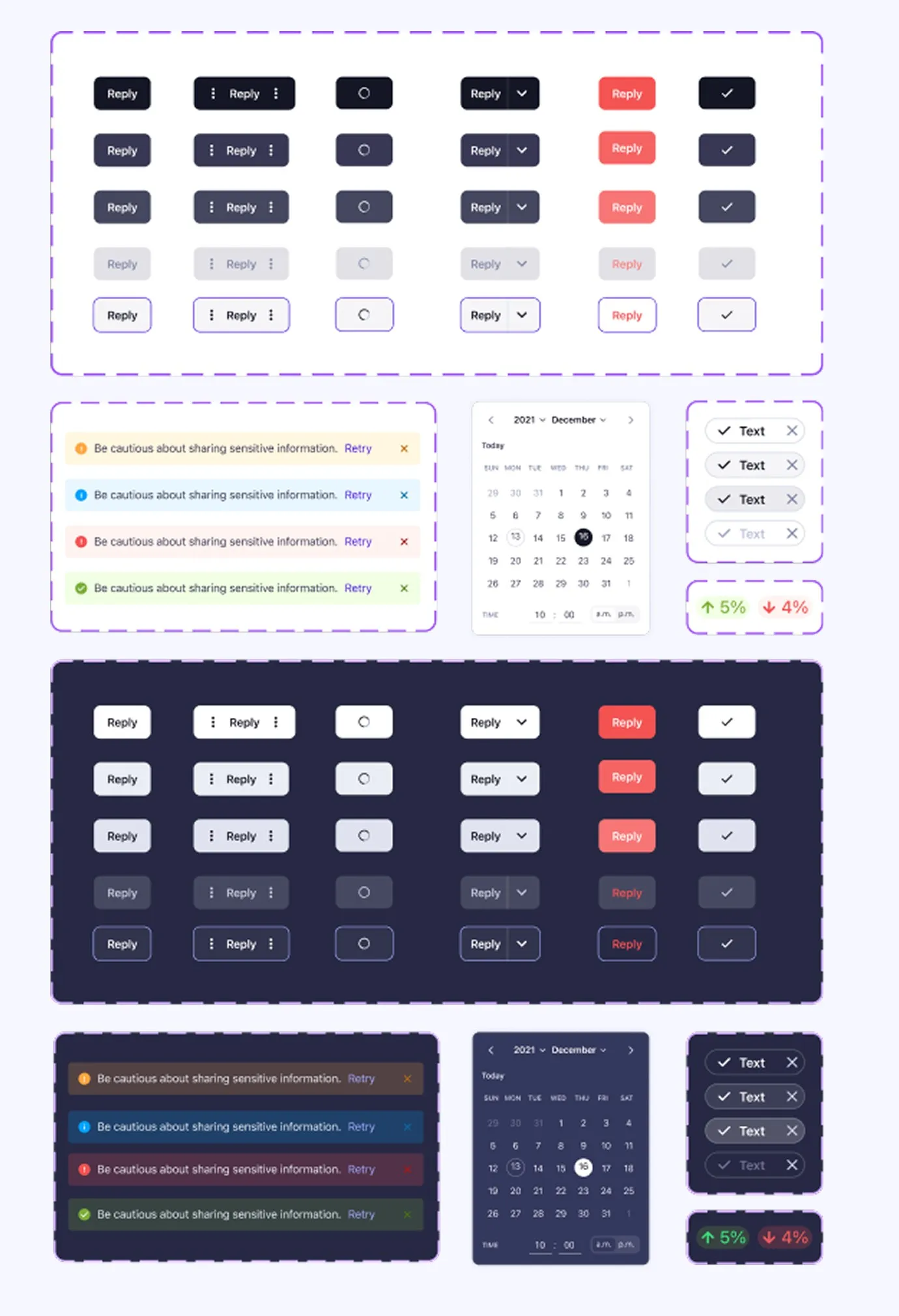
Nobody asked for a design system — I pushed for it myself: without one, a product that is rebuilt at every change of vision would have fallen apart visually.
I built a component library for light and dark modes with clear specs, then led two frontend developers through implementing it in Storybook: setting tasks, reviewing their work, managing updates. Development sped up and the interface stayed consistent.
Testing
The tests were quick and informal — mostly corridor testing. I asked colleagues, including non‑designers such as HR, to do a real task in the product: plan a company event. That surfaced problems in the AI answers and in navigation.
“This is exactly what I needed two months ago when I was planning the company event!”
“The split-screen feature is a lifesaver! Now I can work with multiple documents at once without losing focus.”
“The tool suggests things I wouldn’t have even thought of — it really saves time and simplifies my workflow.”
What we did not expect
People did not understand what to do after the AI returned an answer block. They simply missed the Maya buttons — and got stuck.
Before
Next actions hid behind the Maya button in the corner of the block. I made them more prominent and added a “What’s next?” block with options. People now saw it — but editing the answer or continuing still took too much effort.
After
Inline editing and an “Ask follow-up” input appeared directly in the block. People understood at once that they could keep working with the answer.
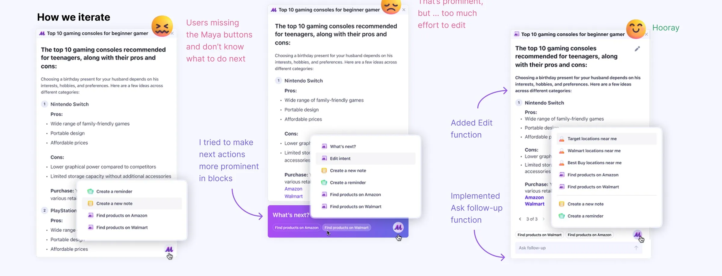
The main lesson: visibility is not usability. Making an action visible is not enough if it is still a long reach away.
Visual language, brand and website
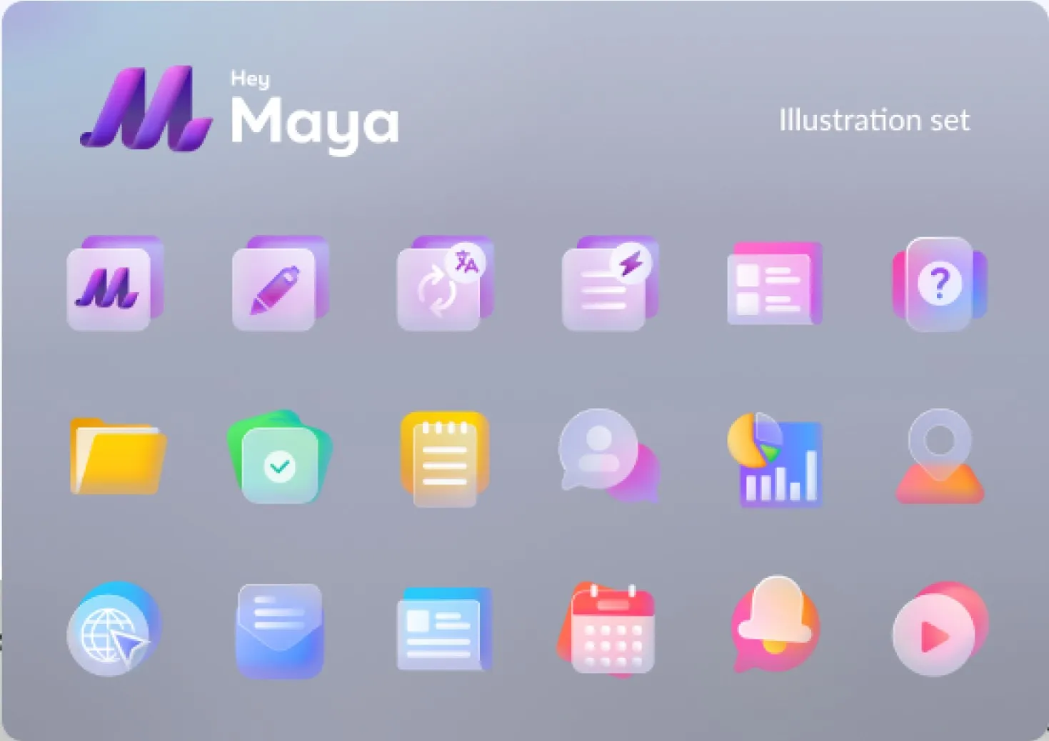
I created Maya’s entire visual language: colours, typography, UI patterns and a set of illustrated icons. The logo was started by another designer; I finalised it and brought it in line with the overall style.
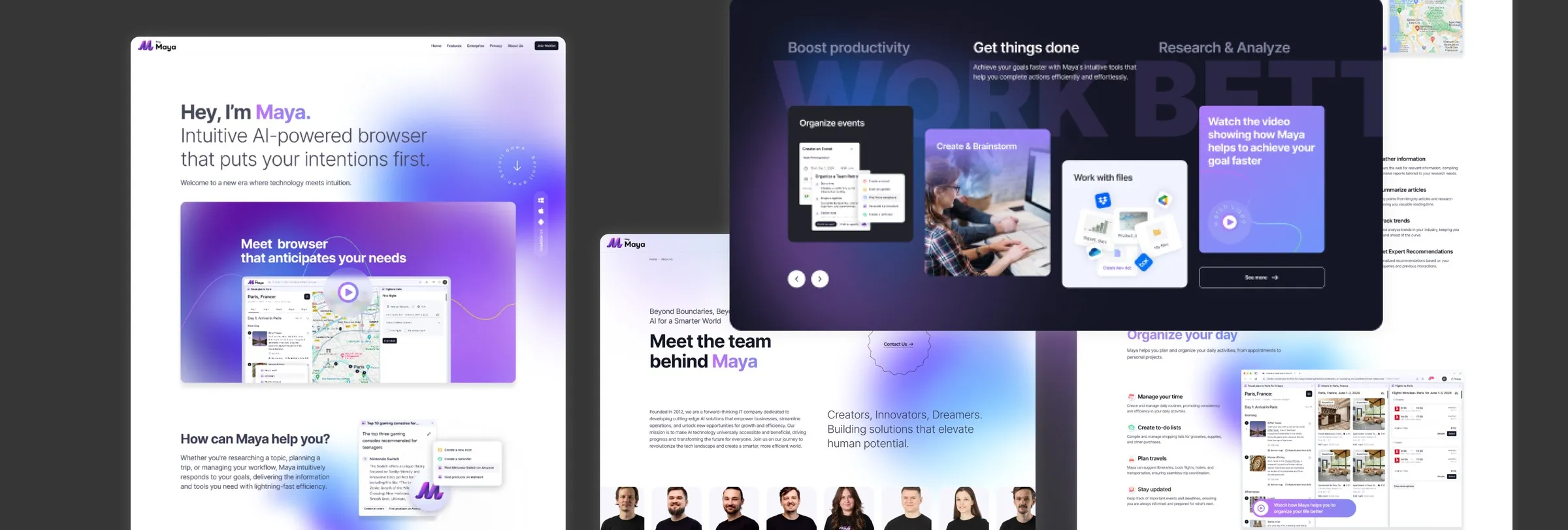
I designed the product website from scratch — from wireframes to final visuals, including all of its content. The goal was simple: clean and modern, with clear navigation and a story about Maya’s key features.

Outcome
In nine months an idea that changed shape several times became a coherent product: a browser with a clear architecture, a dozen plugins, two themes, a design system in Storybook, a brand and a website.
In testing, participants praised the intuitive interface and the AI features — and the fact that email, documents and plans finally lived in one place.