Educational program for kids Oceanautica
Online learning platform providing theoretical basics of diving, medicine, underwater vehicles, underwater archeology & robotics.
The project overview
Online learning platform providing theoretical basics of diving, medicine, underwater vehicles, underwater archeology & robotics. Based on the results of training process, children with best score are selected for the participation in the thematic session in the Children’s Health Camp «Orlyonok».
Program process
-
Sign up
-
Questionnaire
-
Learning & Tests
-
Results
The project is a finalist of the state award «For loyalty to science»
Awarded with a medal of the Ministry of Science and Education of the Russian Federation
- 6
- years of work
- 6,000+
- children got theoretical skills
- 600
- children got practical skills
Challenges
- Project evolving for 5 years without UX expertise and dev effort was focused on resolving daily tasks and supporting the project during the active phase only. The project team got a bandwidth to conduct research and fix the weaknesses in the interface.
- Current library was not sufficient enough to fulfill all the needs.
- The laws require parents to provide the personal info but children themselves need to pass the educational process. All the flows happen in the same account which complicates the usage of the web application for parents cause they might have several children and need to switch between accounts. Also children get the notifications that they don’t need.
- During first phases of the program the support team is overloaded by the requests about enrollment and questionnaire
Goals
Resolve the customer’s and program support’s pain points which are provoked by the initial enrollment and questionnaire.
Review learning user experience
Conduct a review in order to catch inconsistencies and see opportunities to enhance UX.
As a solo designer
- I conducted stakeholders interviews, defined & analyzed the pain points, requirements and scope for this iteration;
- Worked in close collaboration with BA and dev team;
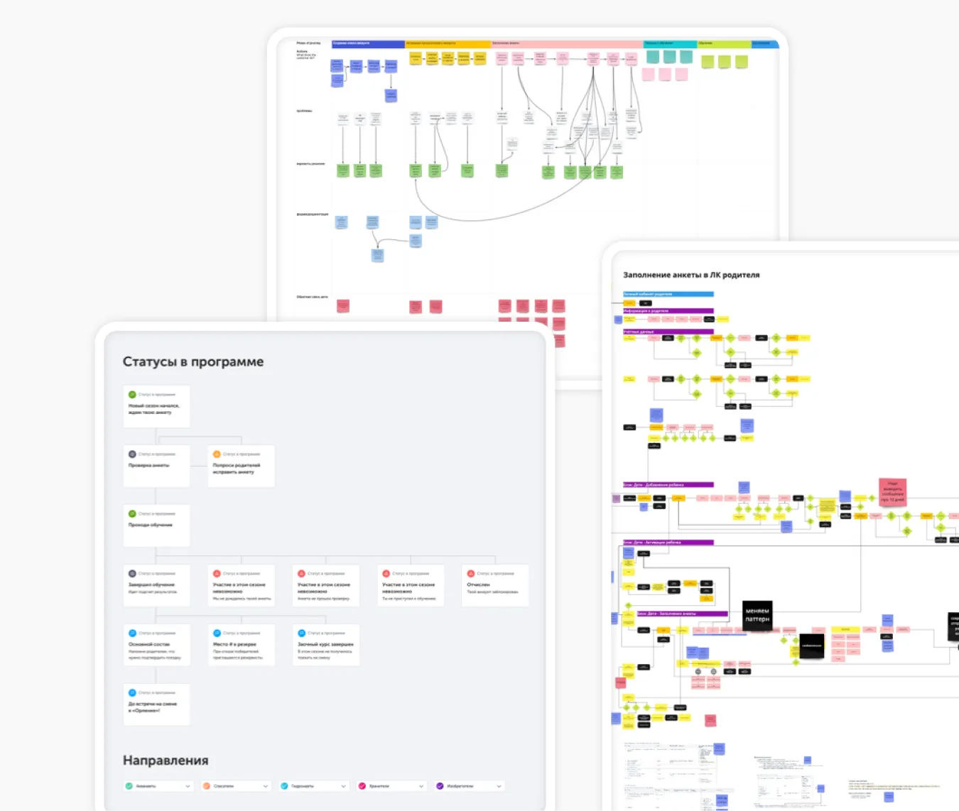
- Did a user‑flow mapping to identify new flows and created the concepts.
- Communicated the solutions to business stakeholders and Dev team on a regular basis;
- Provided design documentation and updated UI kit for the project.
Results
Accounts
Before
Parents and their children having completely different tasks are forced to use one single account. It has been overcomplicating experience for both types of user. Also, this single account did not provide specific information that parents as well as children would be interested in. It was additionally mentioned about the interest of parents to their children progress and score.
After
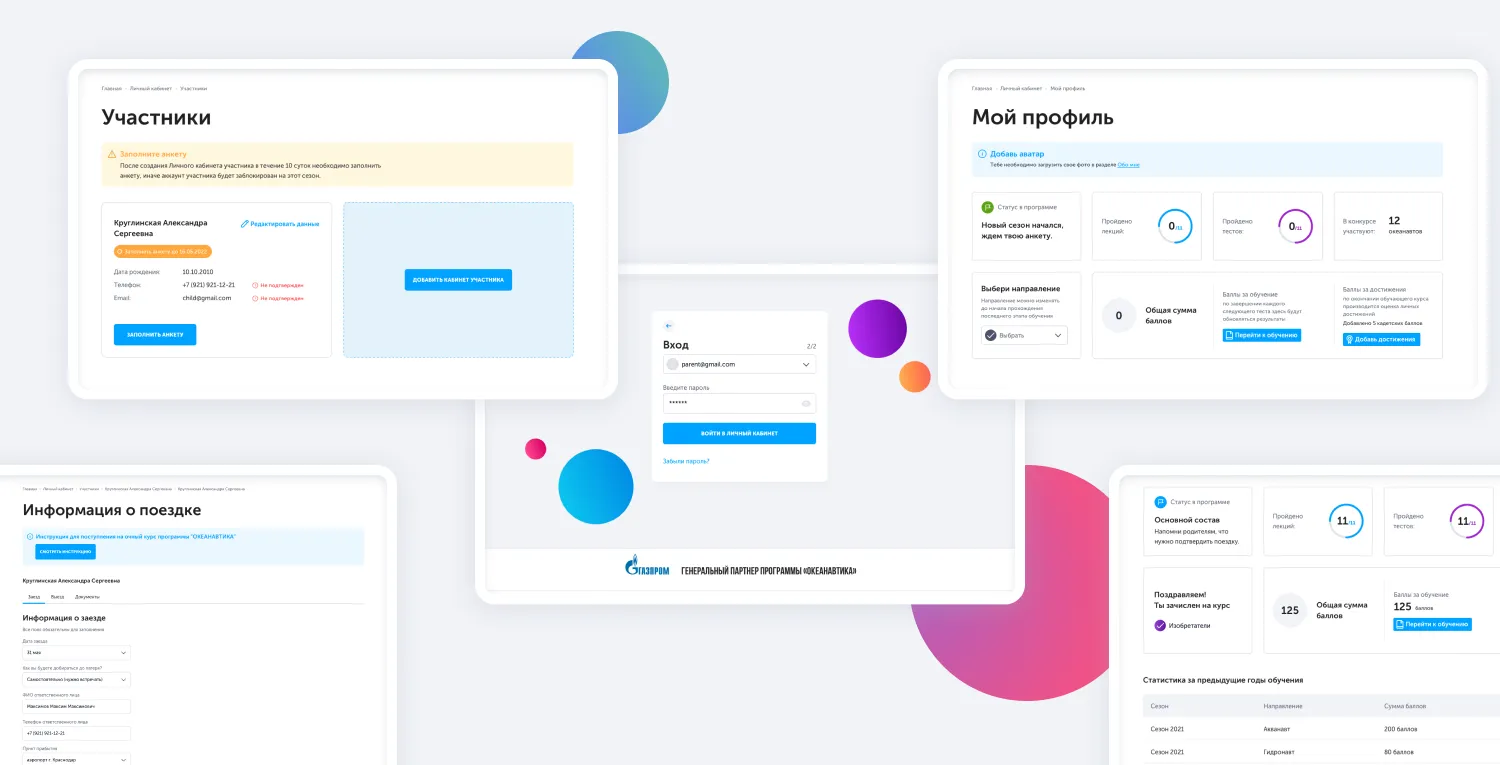
I divided the flows for parents and children. Both types have their own personal accounts. The parents can add several children in their dashboard and see their progress in the program. Dashboards in children accounts had new features “score breakdown” for tests and achievements which helps to decrease the numbers of requests for support. The system of statuses was enlarged which enhanced the better understanding of the process.
Questionnaire
Before
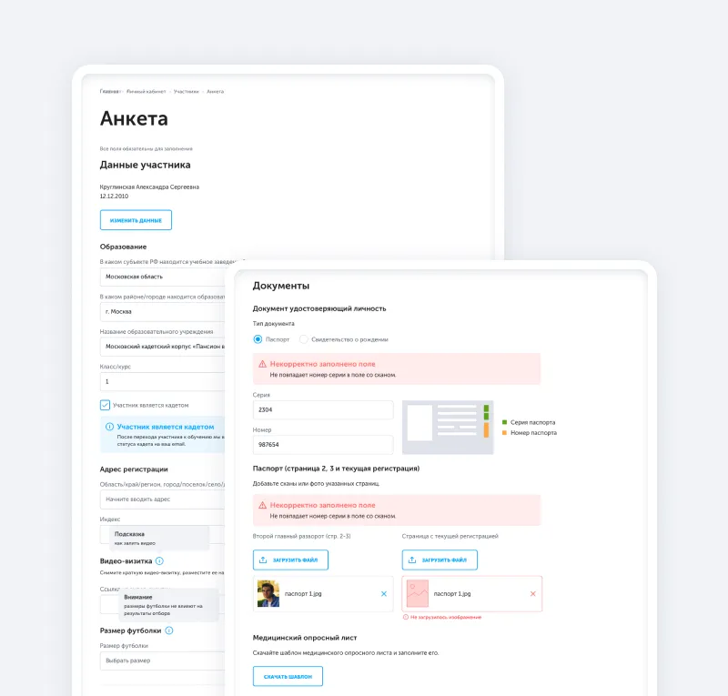
Initial questionnaire provoked multiple issues for users: Limited in time and attempts parents needed to submit separately each of 5 steps of questionnaire with different info required, if one of the steps was failed parent got the instruction from support how to resolve the issue (the communication about the issues was done via email). Some questions in the questionnaire were addressed to children. Parents made some mistakes (ex. making the address copy compliant with the field validation)
After
I made the questionnaire flexible with 1 step and reviewed the information needed. Different profiles allowed to split the questions for parents and children. It also reduced the load of support cause with 1‑step‑questionnaire the support specialist reviews it with all info filled in and can leave the comments right next to the fields. The support specialists also say that data processing became easier.
Learning&Tests
Before
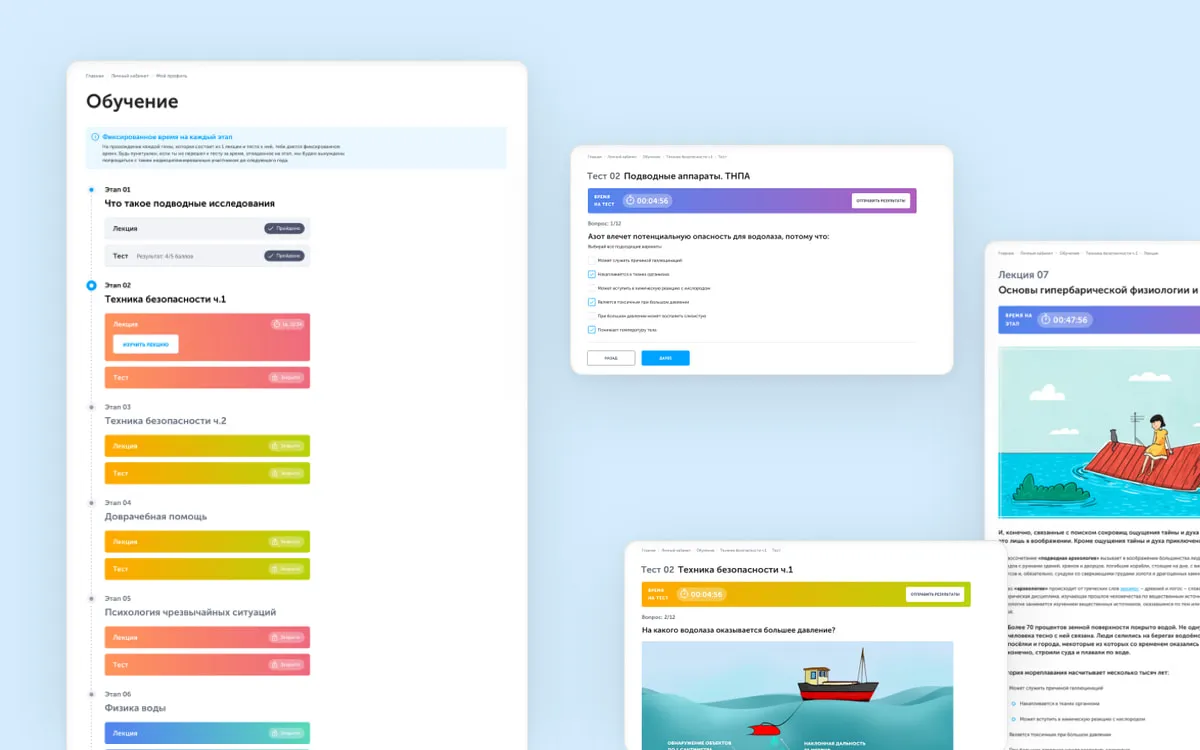
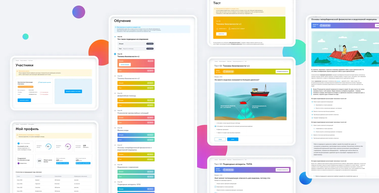
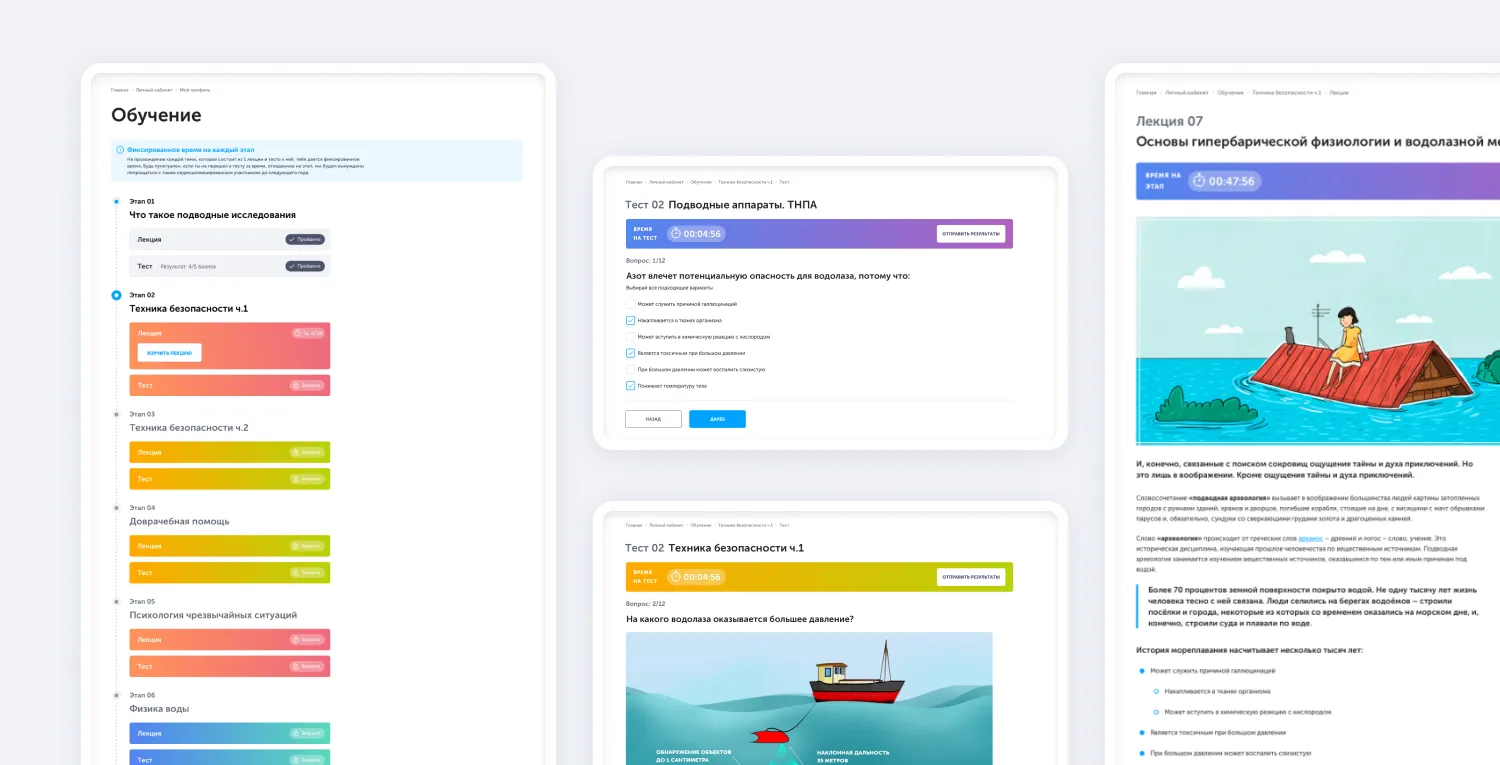
Lectures and tests initially separated on different pages and were illustrated in two standalone timelines. But the process implies that each lecture has a dedicated test for the same theme. After finishing lecture user proceeds to a test, so they basically need to move to another page. Users were curious about their score breakdown for each test and addressed these questions to support specialist.
After
I combined the lectures and tests sections in one timeline and changed the styling to illustrate the progress so that the student didn’t need to switch between the different pages to go to the next step. I also displayed the points for each test right in the steps list so that the students could see the score for each test. We changed the placement of the «past/next» buttons which helped to reduce 90% of the occasional closure of test.
Reward & Fun
Meeting this project 5 years later to review and make some changes, I had an unique opportunity to evaluate my own work from a different perspective and see my progress.
Underwater robot competitions fan paraphernalia
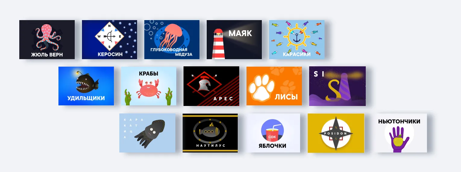
Underwater robot competitions are held annually as part of the Oceanautica program. 5 teams create their own underwater robots and compete for the championship while their teammates cheer for them. So, for the last, cheering teammates, I create fan flags for team robot and logo designs. It’s more for fun activity, but bring so much value)
These are couple of sets:
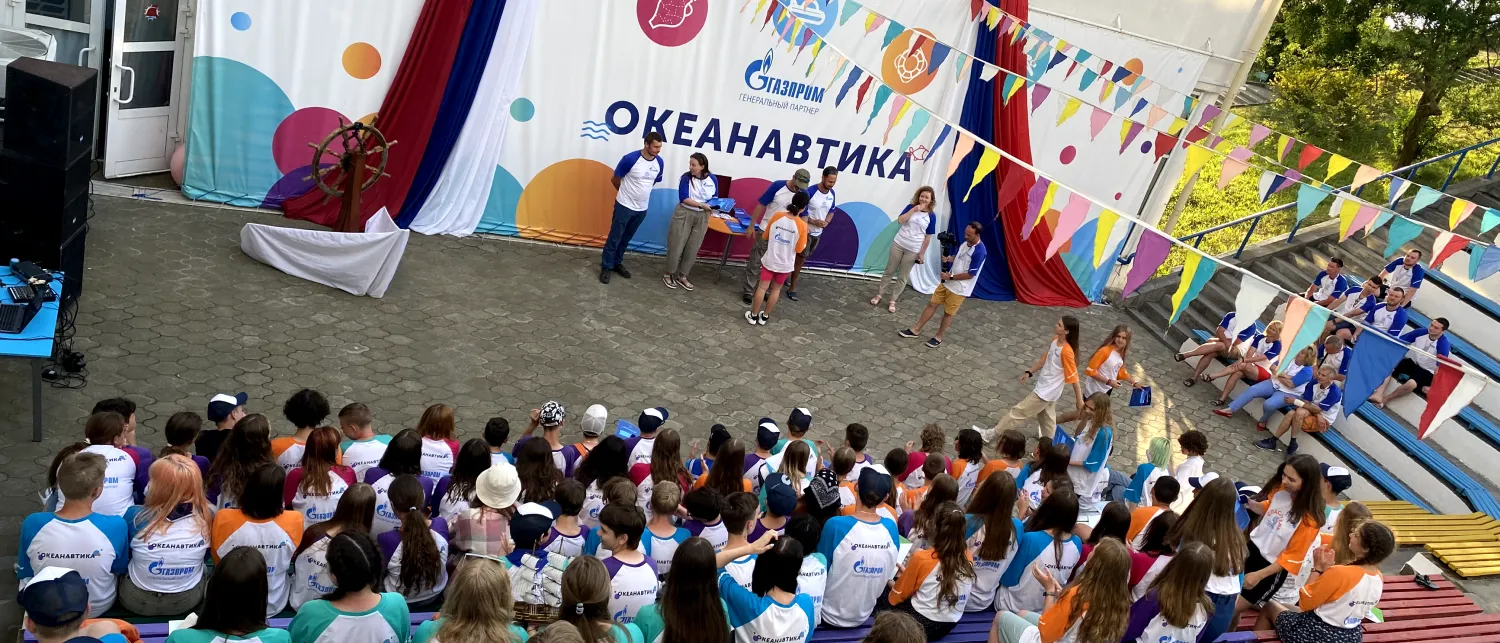
How great it is when you’re able to physically “touch” the product you’ve worked with.