Lamoda: Virtual wardrobe & returns reduction (study project)
A self‑directed study project: a personalised virtual wardrobe concept for a fashion marketplace, aimed at cutting returns caused by size mismatch and making recommendations more relevant.
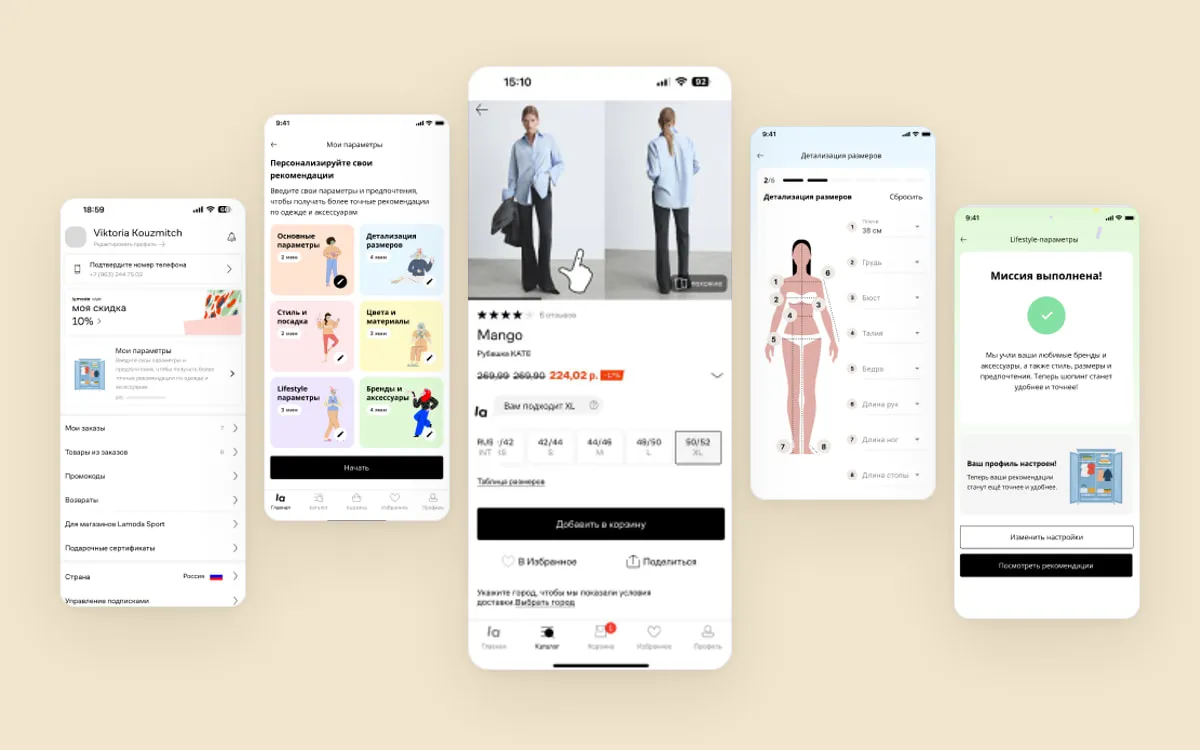
Context
A study project, worked end to end as if it were real: I took Lamoda — a fashion marketplace I know as a customer — and ran a business hypothesis through research, concept, prototype and a test design.
Business hypothesis. Customers who have been buying their whole wardrobe on the platform for three to five years need a tool that helps them make better use of their purchase history. A virtual wardrobe would become a point for upselling, recommendations and retention.
I set the metrics it would be judged on up front:
- Hard metrics
- Orders, add‑to‑cart conversion, turnover from new categories
- Soft metrics
- User satisfaction, average time spent in the wardrobe
Problem
- 30–40%
- return rate in fashion — higher than in other categories
- 62%
- of returns are down to the wrong size
There is no unified sizing standard: a US size 10 is a UK size 14, which makes the problem worse rather than merely inconvenient. Research surfaced three problems to work on:
-
A high return rate
-
Difficulty choosing a size
-
Recommendations that are not personal enough
Process
-
Goal setting: objectives and key results for the concept
-
Competitive analysis: marketplaces and wardrobe-management products
-
In‑depth interviews: eight conversations with users of the platform
-
Hypothesis backlog: problems and solutions
-
User story map: key features across the stages of the user journey
-
Prototype and UX testing with the target audience
-
Metric tree and A/B test design
Goal setting
I started with objectives and key results for the concept, so that later decisions could be argued against something other than taste.
- Objective
- Improve the user experience and grow sales through a virtual wardrobe: engagement rises because people see what they have bought and combine it into outfits, and conversion rises through personalised recommendations.
- Key results
- More items added to the cart from recommendations, and more purchases from new categories such as accessories and shoes.
Competitive analysis
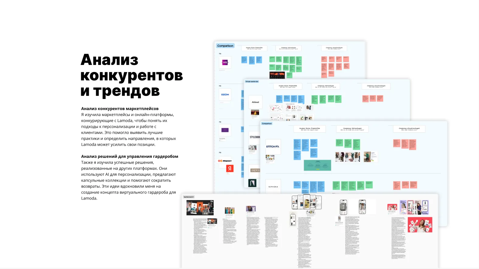
I looked at the marketplaces competing with the platform to understand how they approach personalisation, and separately at products built specifically for wardrobe management. Those use AI for personalisation, offer capsule collections and work to reduce returns — and that is where the virtual wardrobe idea came from.
In‑depth interviews
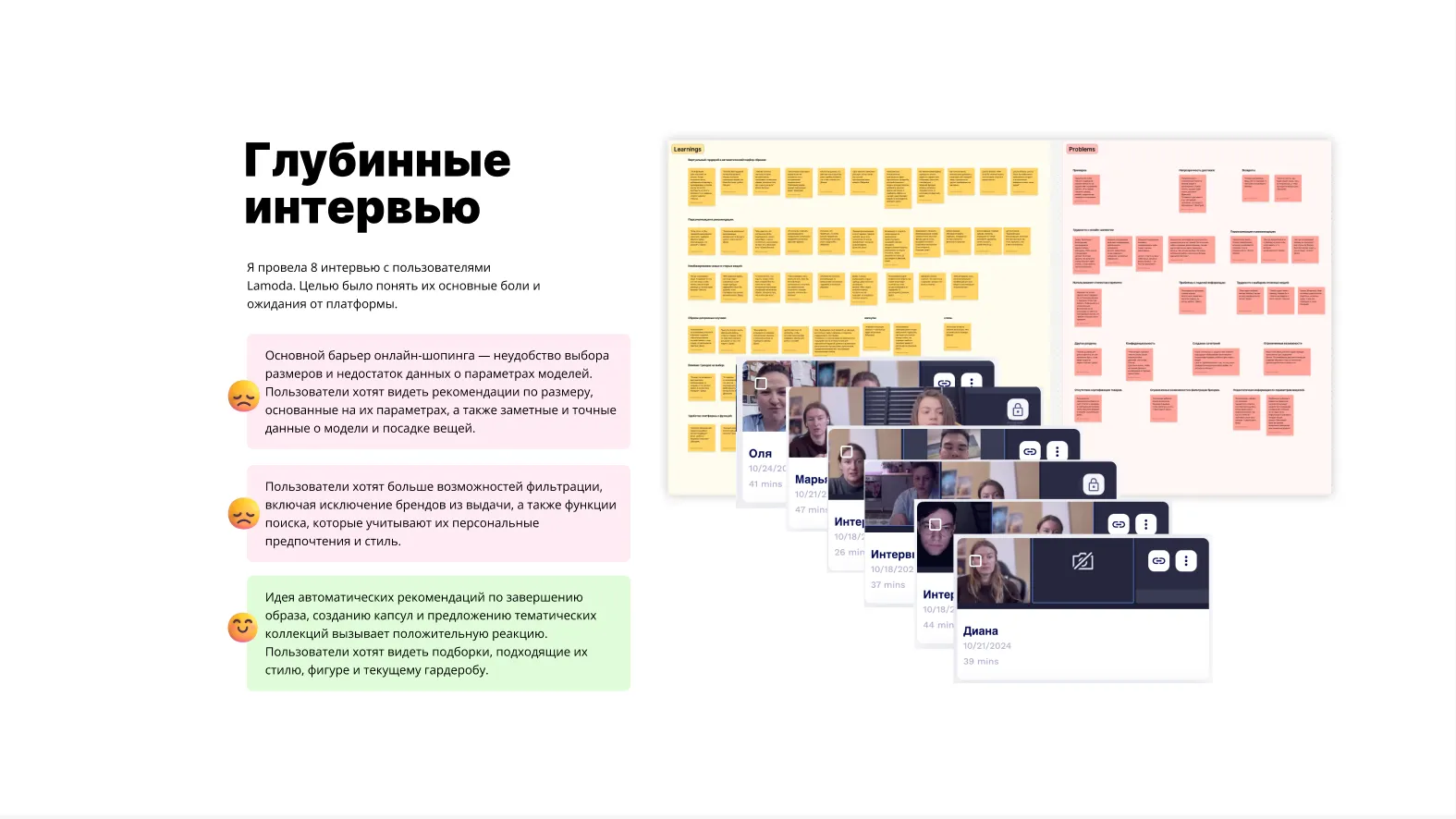
I ran eight interviews with platform users to understand their pain points and expectations. Three findings mattered most:
-
Size is the main barrier. People want size recommendations based on their own parameters, and visible, accurate information about the model and the fit.
-
Not enough filters. People want to exclude brands from results and search with their own preferences and style in mind.
-
Selections — yes. Outfits, capsules and themed collections got a warm response — as long as they suit people’s style, body and what they already own.
Hypothesis backlog
From the collected data I built two lists: problem hypotheses and solution hypotheses. That is what pointed me at personal parameters as the thing to design first.
A risk for the business. A wardrobe that suggests combinations could reduce sales on the marketplace: some users mentioned that they try to avoid unnecessary purchases.
So I focused on solutions that improve the experience for users and also support the company’s business goals.
User story map
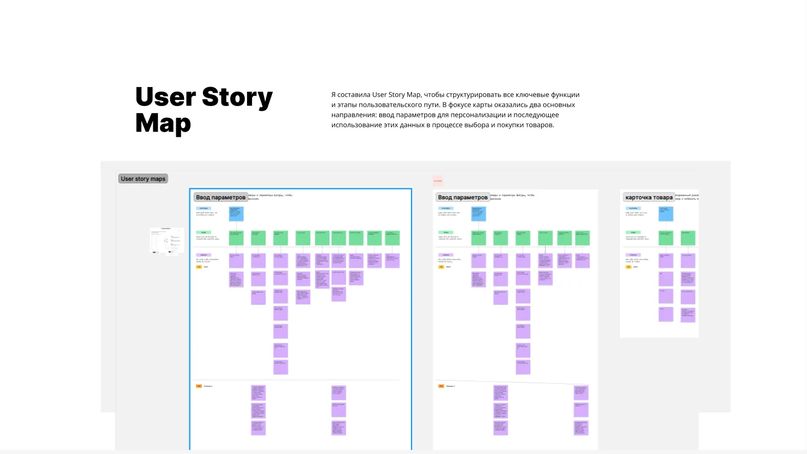
I mapped the key features and the stages of the user journey. Two directions ended up in focus: entering parameters for personalisation, and then using that data while choosing and buying.
Prototype and UX testing
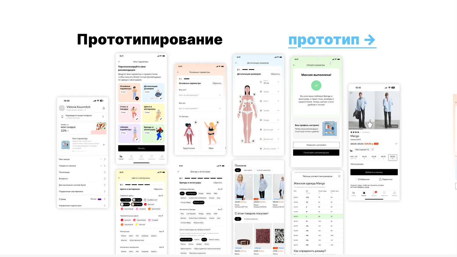
I prototyped the flow and tested it with people from the target audience: they went through every step of entering parameters and interacting with the personalised recommendations.
What I heard. The response to personalisation was positive — useful and convenient, provided the interface stays as simple as it can be. The settings would save time choosing clothes and help avoid size mistakes.
Testers asked for two things — both went back into the layouts and reordered what mattered for development:
- A visible progress indicator while filling parameters in.
- More detailed hints on the size‑entry screens.
Metric tree and A/B test design
I built a metric tree down from the main goal — raise the purchase rate, cut returns and lift CSAT — then designed an A/B test around a single hypothesis.
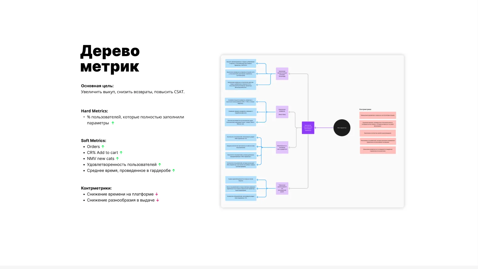
Hypothesis. If people can state their parameters — size, style, fit — in a “My parameters” section, returns fall and the purchase rate rises through more relevant recommendations. Satisfaction rises too, because people are shown more things that actually fit.
Test groups
- Control (A)
- Without “My parameters”
- Test (B)
- Use “My parameters” for choosing and for recommendations
- MVP group
- A basic version — only sizes can be entered
Target audience
- Gender and age
- Women aged 18–45 — the segment that buys clothes more often and struggles more with choosing size and fit
- Activity
- Regular customers who order at least once every one to three months
- New users
- They show what a first encounter with the feature looks like
Metrics
The main hard metric inside the test is the share of users who fully filled in their parameters. Around it sit the soft metrics: purchase rate, return rate, conversion to purchase after viewing a product card, clicks and purchases from recommendations, CSAT, NPS, time spent in “My parameters”, and trust in the platform, measured through positive feedback on personalisation and complaints about size mismatch.
Success criteria
For users who filled in their parameters:
-
Returns fall by 10–15%
-
The purchase rate rises by 5–10%
-
CSAT no lower than today, with growth of at least 5%
Risks and how to soften them
The counter-metrics are time on the platform, product variety and the number of views — all of which can drop if the feed gets too narrow. Each risk came with a planned response:
-
Too few products in the feed. Show items that match at least 70% of the parameters, labelled “Doesn’t match all your parameters, but may fit”.
-
Satisfaction drops. Let people switch filtering off temporarily, and remind them that parameters can be changed at any time.
-
Time on the platform drops. An “Inspiration” section with selections based on the parameters — alternatives as well as exact matches.
The test is planned for four to six weeks — long enough to collect data across the whole chain of choosing, buying and returning. The groups are then compared on the main metrics and the counter-metrics.
Solution
The honest conclusion from the research was that it should not be an online wardrobe — at least not first. The wardrobe was the ambition; the thing worth building first was personal parameters feeding the recommendations.
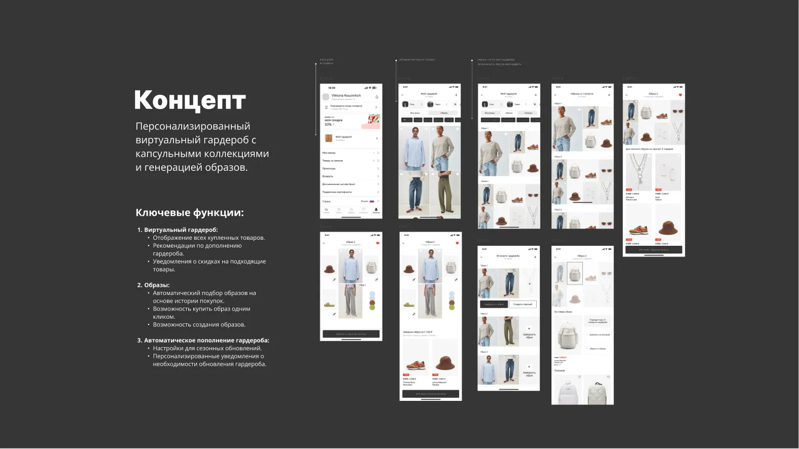
The concept is a personalised virtual wardrobe with capsule collections and outfit generation, in three parts:
-
Virtual wardrobe. Everything already bought, recommendations for what would complete it, and alerts when a matching item goes on sale.
-
Outfits. Automatic selections based on purchase history, buying a whole outfit in one click, and building outfits yourself.
-
Auto‑replenishment. Settings for seasonal updates and personalised prompts when the wardrobe needs refreshing.
The interviews also turned up three directions worth studying rather than building straight away:
- Stylists. The platform as a tool for building wardrobes for clients — which would open up a professional audience.
- Paired looks. Parent-and‑child or couple outfits.
- “Complete the look”. Recommendations for whatever has been selected: people find it easier to put together outfits that hang together, especially when they are unsure about combinations. It could lift engagement and cross-sales, but it needs a considered implementation.
Result
The concept was developed and tested, the key metrics and growth areas were identified, and the hypotheses were written up for subsequent testing. Nothing here was shipped — this is a study project, and the A/B test is a design for one, not a result.
What the work concluded:
-
Personalisation increases engagement and can reduce returns.
-
A “My parameters” tool is something users actively want.
-
There is room to extend it: stylist selections, family wardrobes, completing a look.
Next steps
Refine the concept with further research.
Test the hypothesis through an MVP or an A/B test.
Roll the feature out to a limited audience and collect data.
Analyse the new metrics and what they do to the product.